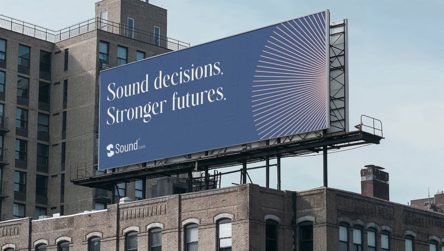
Sound Decisions. Stronger futures.
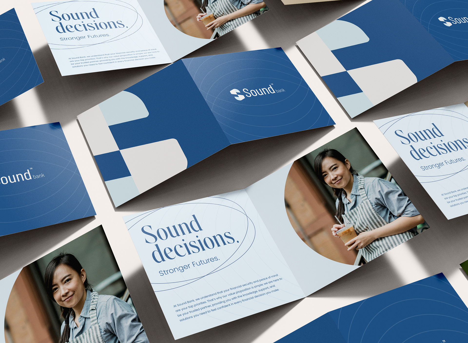
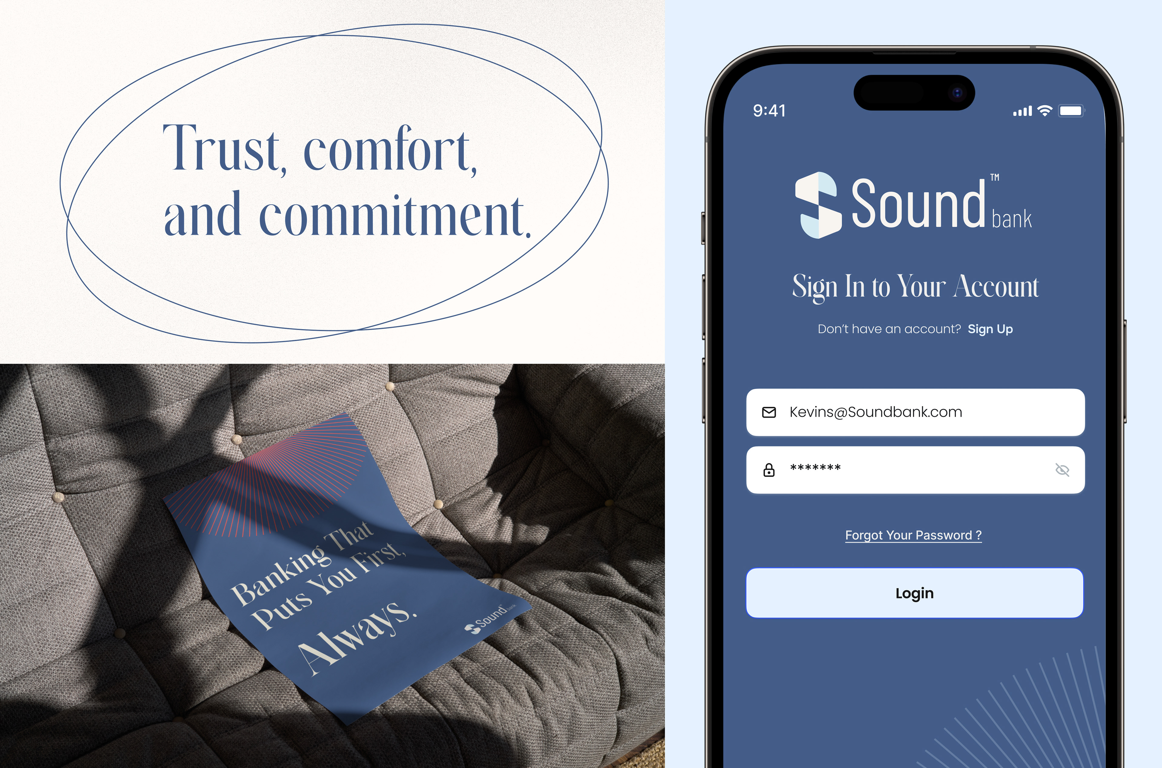
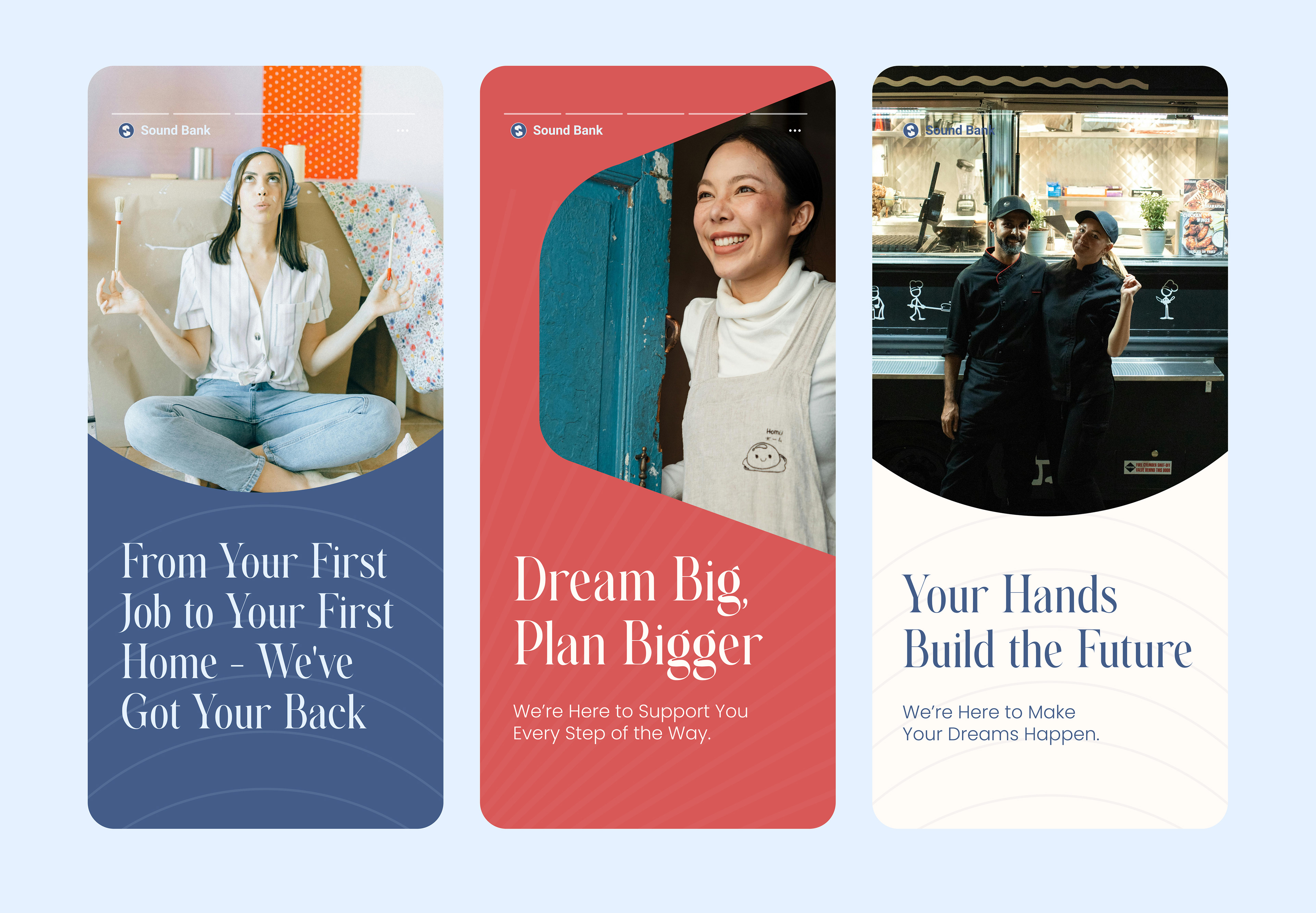
The creative direction embraces home bias, capturing a local Americana sense of domesticity. It highlights the value of hard work with soft colors that support local businesses, while serifs add a classic-modern, historic touch. I used softer tones to evoke comfort, easing the stress often associated with finances. The photography follows a raw, authentic style to ensure a cohesive and genuine feel.
The Identity
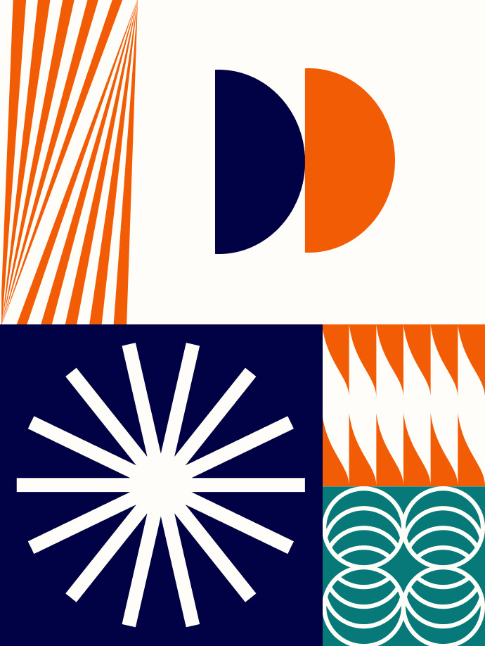
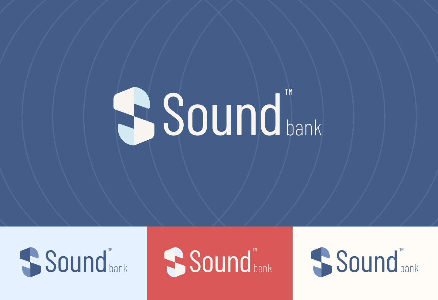
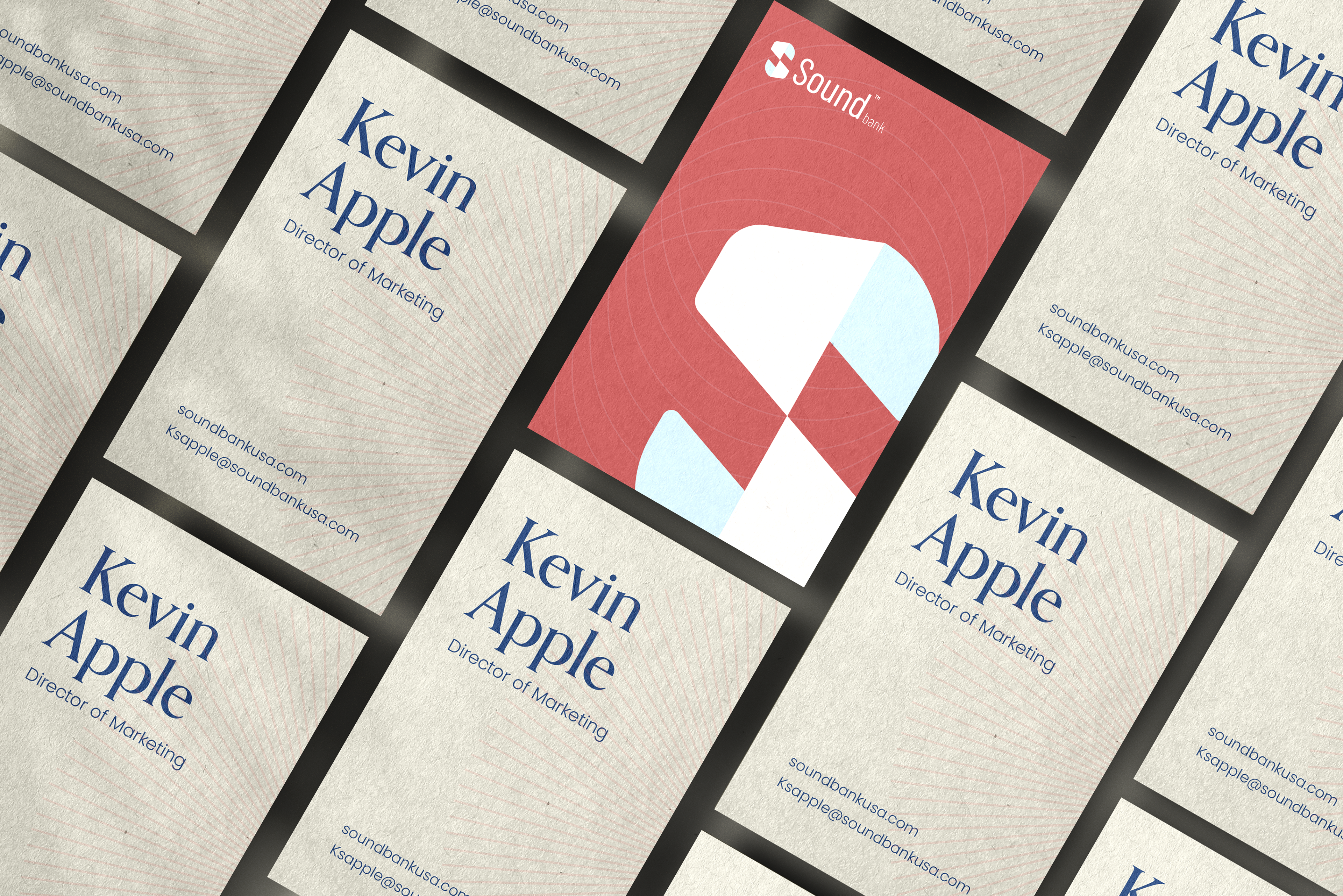
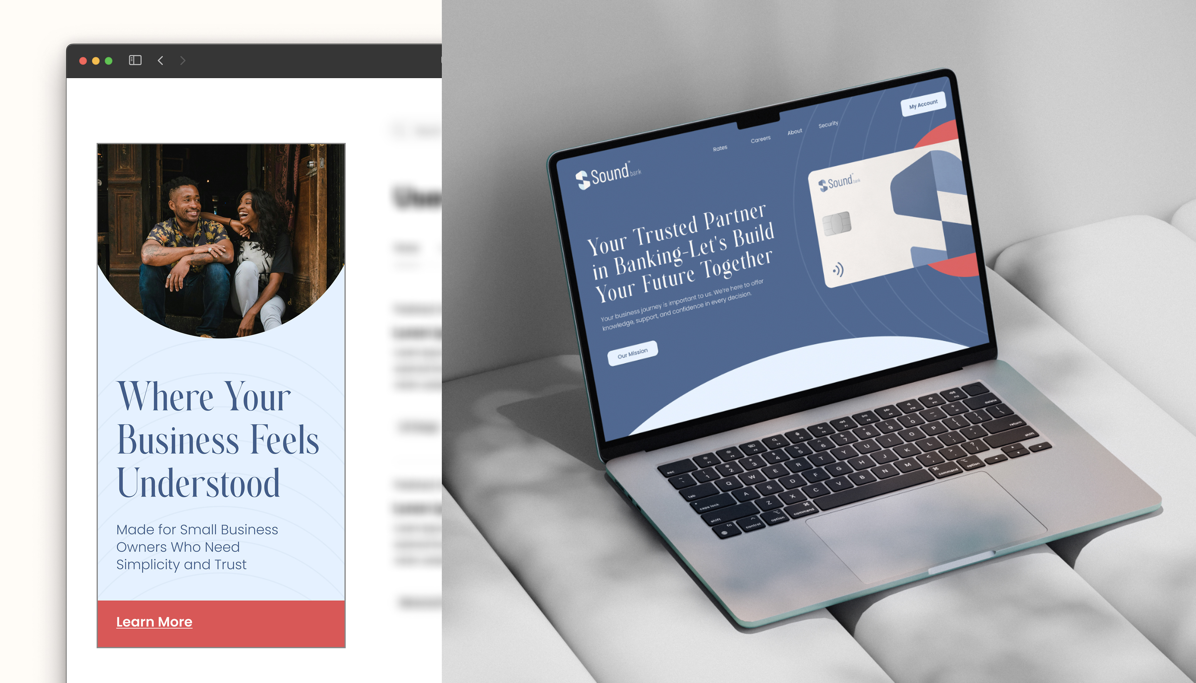
To convey commitment, support, and most importantly, a feeling of security, I used cool color tones to create a soft and comforting visual foundation. A serif font introduces a traditional element to the modern logotype and glyph, helping to balance a timeless feel with a contemporary edge. Rounded edges, subtle patterns, and circular forms suggest wholeness while remaining welcoming and friendly. The combination of strength and softness was a key driver in the creative direction. Patterns were used to bring a sense of stability and paired naturally with the calming blue and soft red tones of the brand.
The goal of this design was to showcase how comforting Sound is and how stable your finances can be.
The Summary
The messaging highlights local businesses and promotes entrepreneurship through social content that builds trust and connection. Design elements and textures support a people-first brand identity that reflects Sound's core values of trust, understanding, support, you, and guidance. These values position Sound as a bank that empowers smart decisions and stronger futures. The brand identity is grounded in this purpose, with every visual and message reinforcing a sense of security and approachability. If launched, the campaign would spotlight local entrepreneurs, reinforcing Sound's commitment to the people driving small business growth.