


The Insights:
To achieve our goal, we needed to build trust across a broader demographic. As part of the data science and strategy teams, I explored the psychographics and behaviors that drive trust and brand loyalty.
I focused on something called familiarity bias, the tendency people have to prefer familiar options over unfamiliar ones, even if the unfamiliar ones might actually be better. This bias is closely tied to cognitive ease, the comfort that comes from processing familiar information.
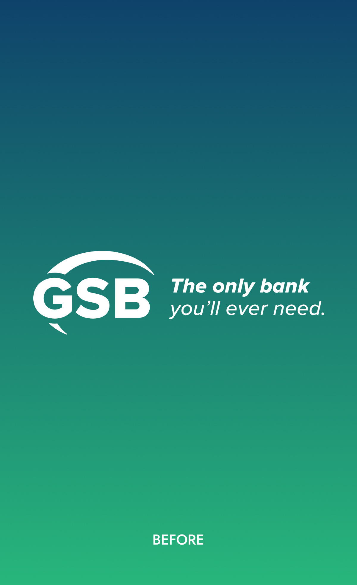
Major brands have relied on familiarity bias to build trust for years. But over time, those strategies became so overused that they started to backfire, eroding consumer trust instead of strengthening it. Still, I believed that if we applied familiarity bias in a thoughtful, strategic way, it could be a powerful asset in GSB’s rebranding.
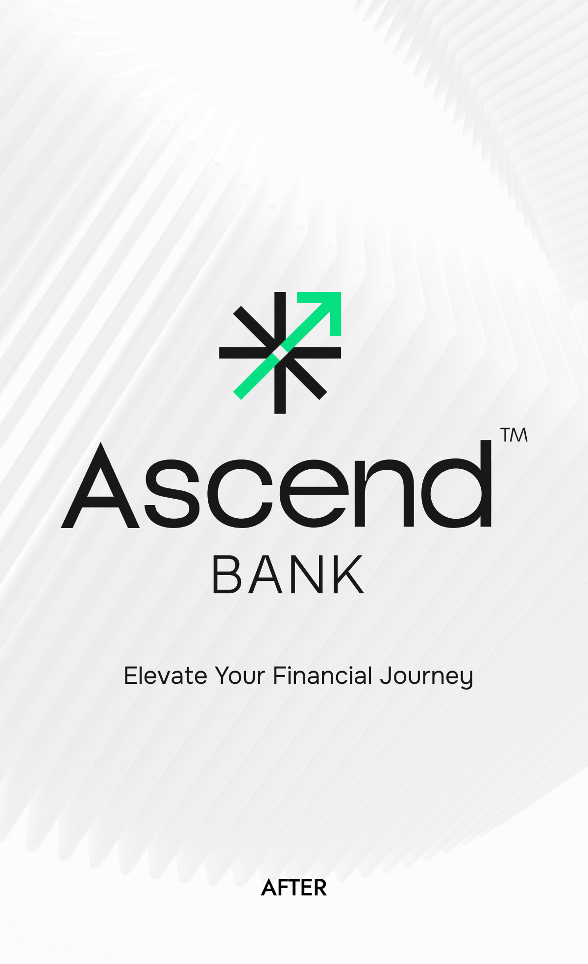
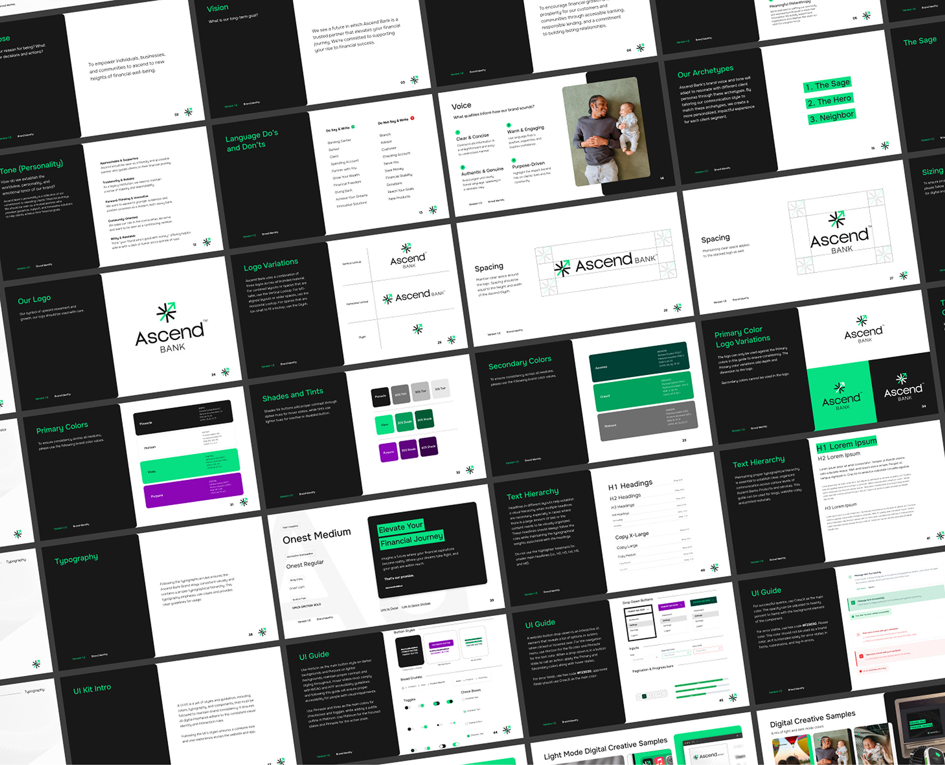
Note: The client requested the TM symbol in the logo for specific deliverables only, but not all shown here include it.
The Solution
In addition to exploring home bias’s impact on GSB’s rebrand, the psycholinguistics analysis showed how language shapes trust and perception, especially for Gen X's logic-driven mindset and Millennials/Gen Z's purpose-driven values.
The stat science team also identified key elements of GSB’s historic brand that resonated with long-time customers, preserving them while adding modern traits to reflect their evolution.
These insights led to a comprehensive rebranding, including:
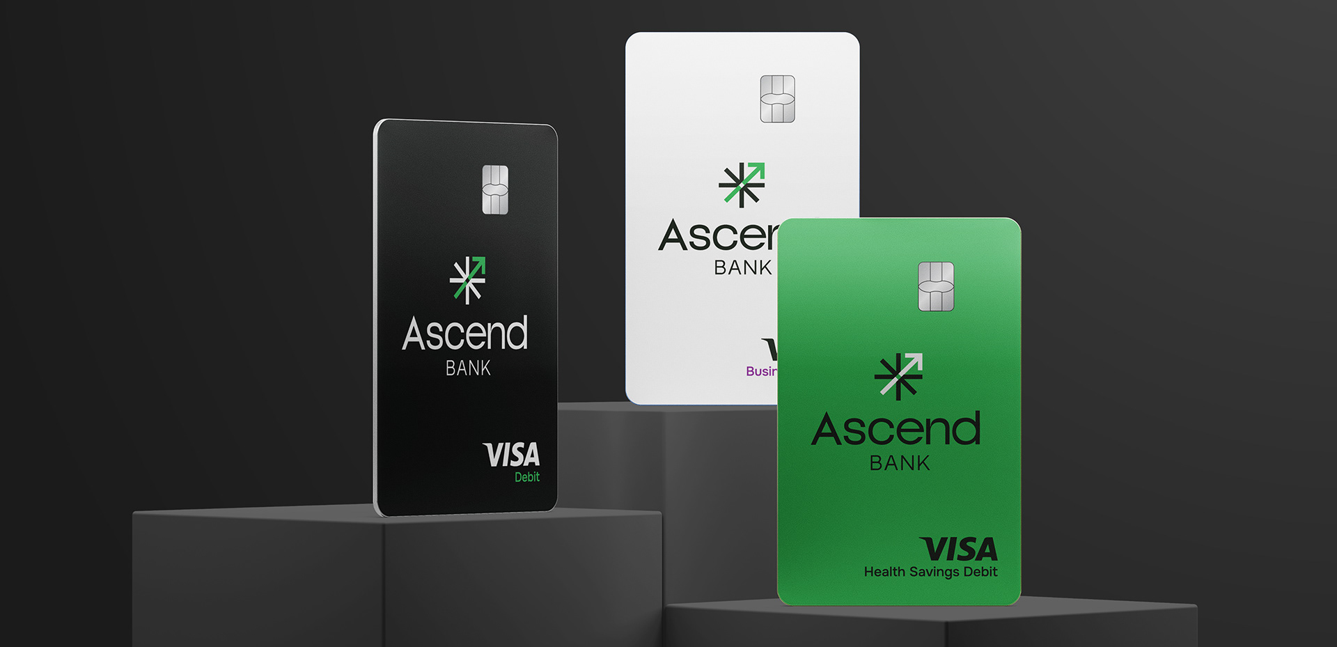
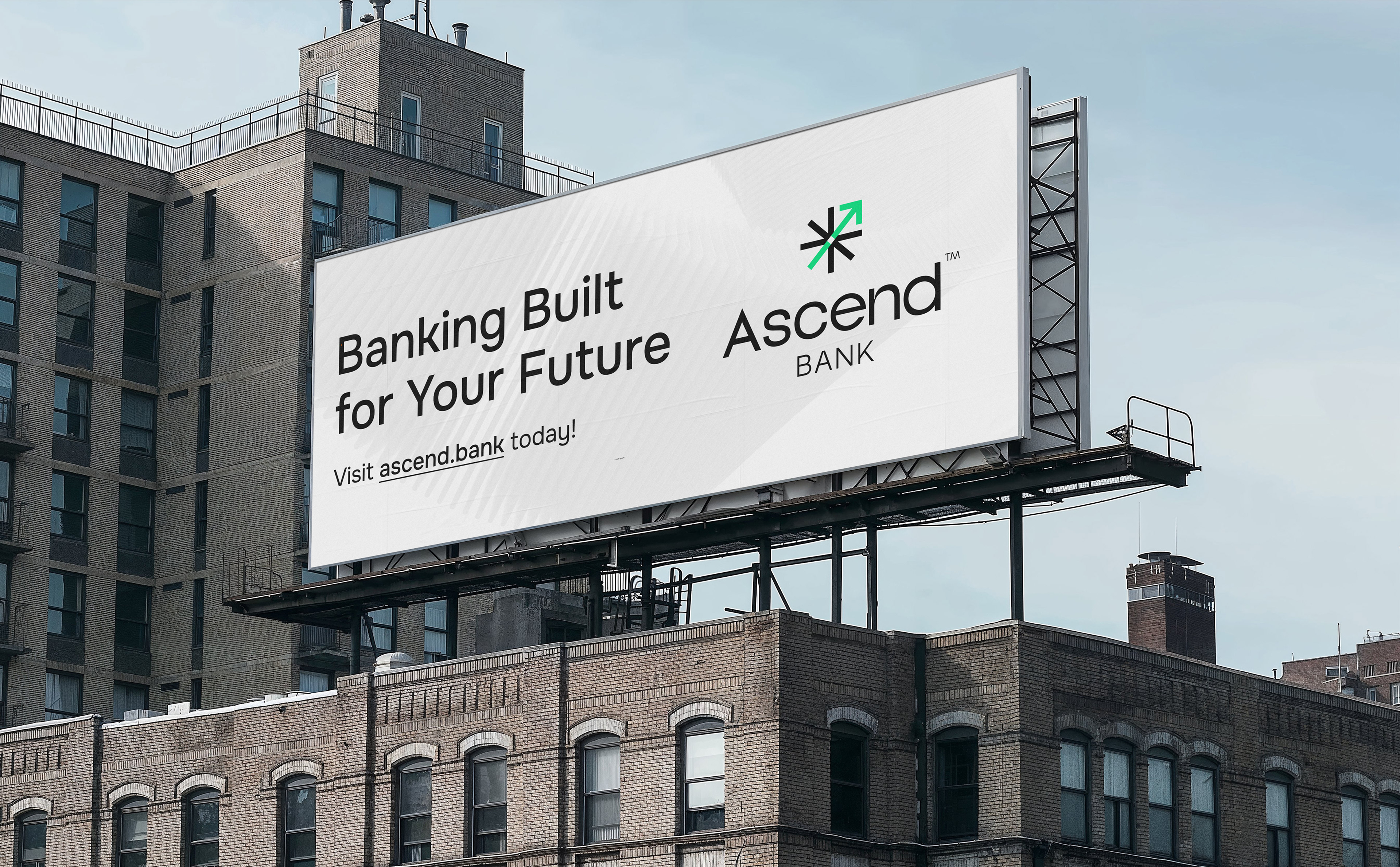
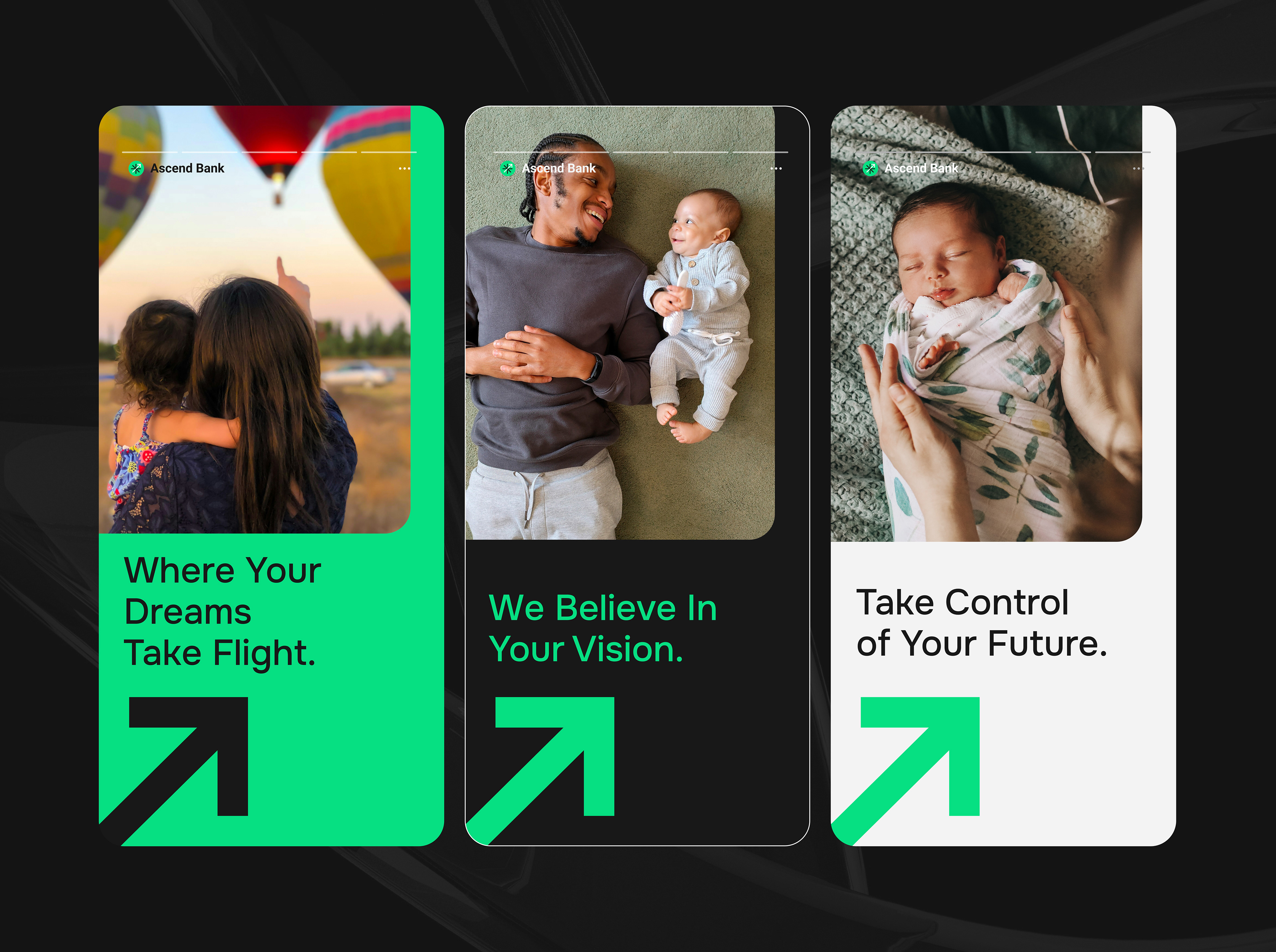
A new name, Ascend, that reflected the promise of an “elevated financial journey”
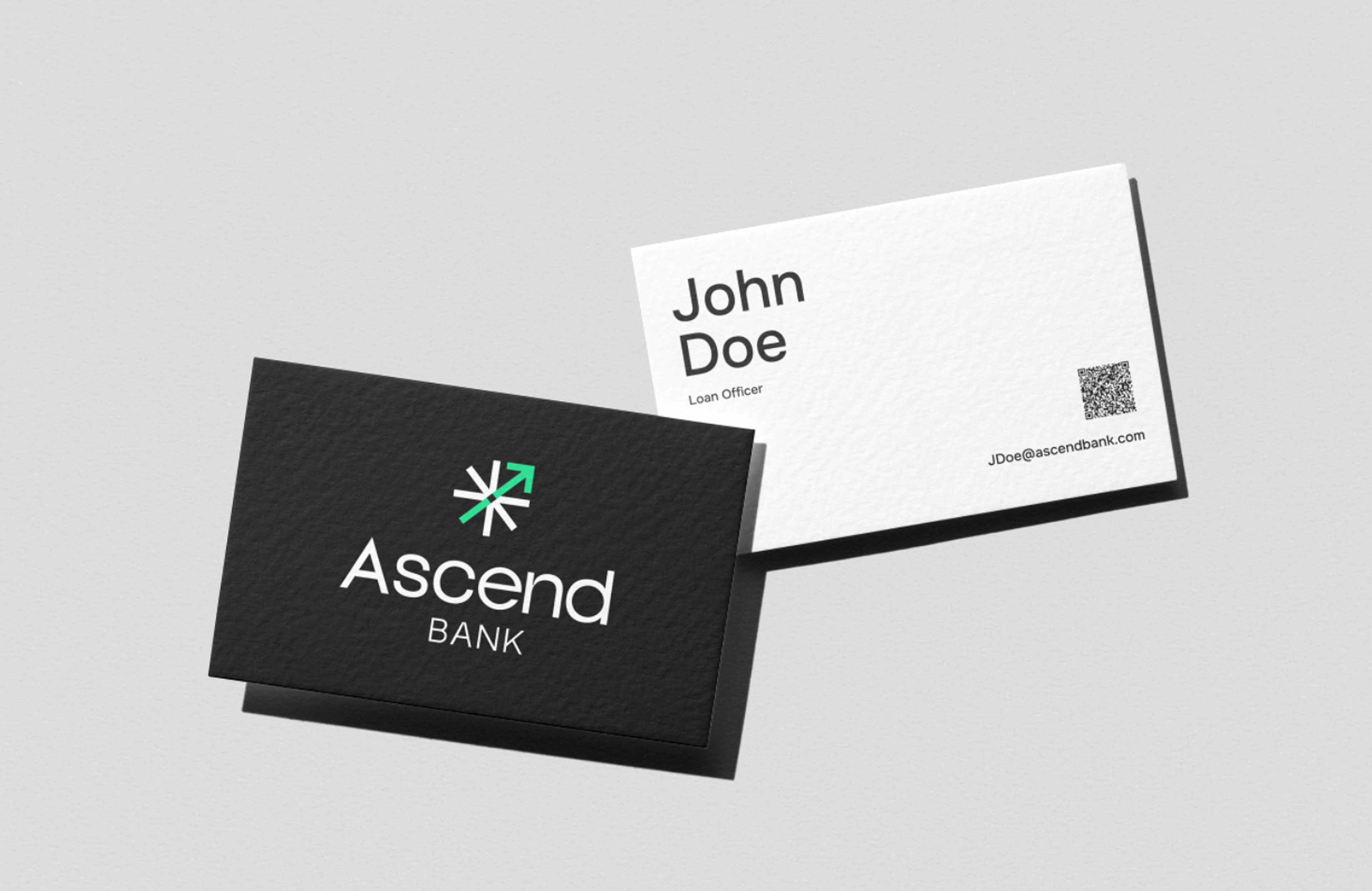
A refreshed visual identity balancing modernity with heritage
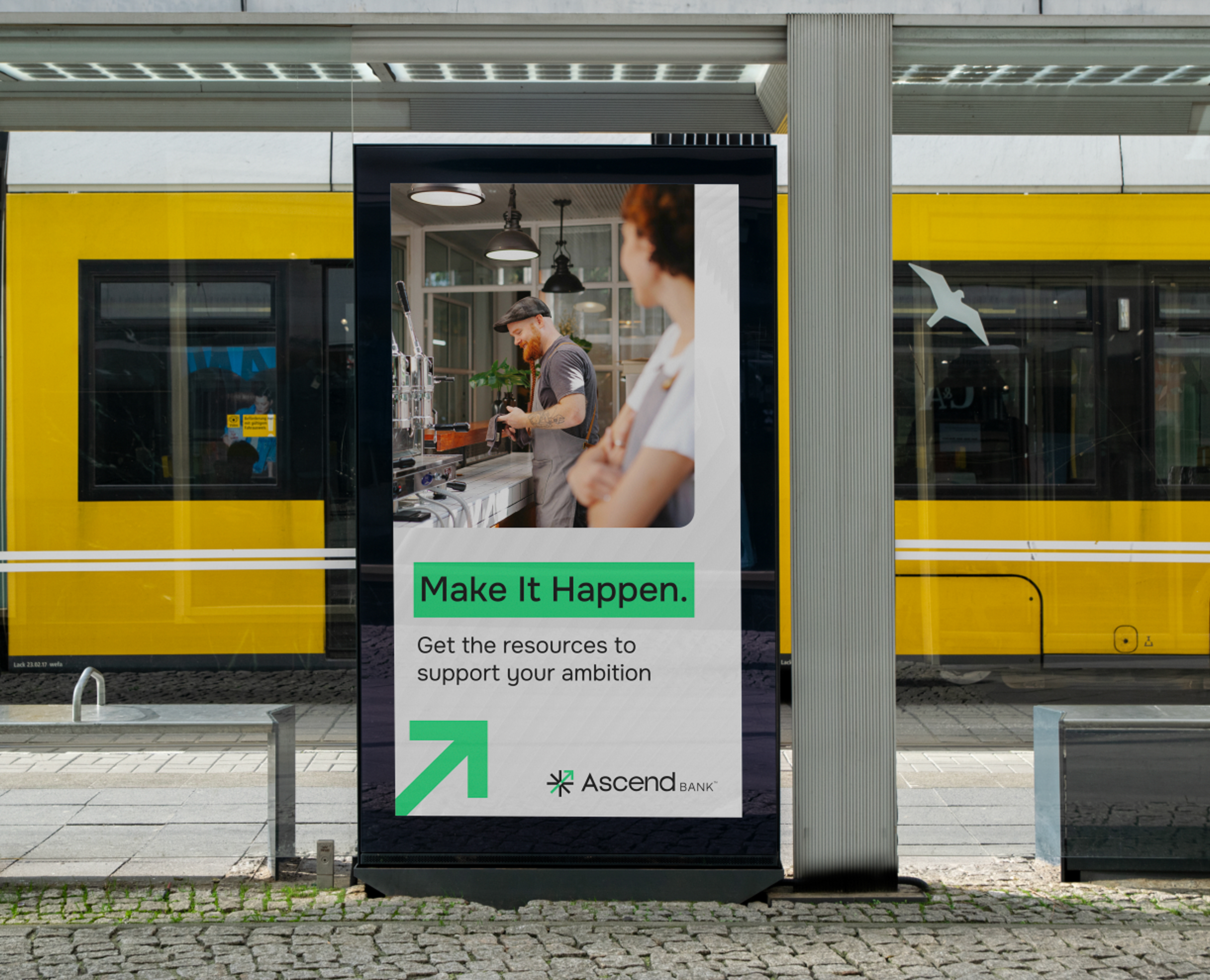
A messaging platform that appealed to emerging audiences' values of transparency, purpose, and community, while retaining the warmth expected by long-time customers
The stat science team also identified key elements of GSB’s historic brand that resonated with long-time customers, preserving them while adding modern traits to reflect their evolution.
These insights led to a comprehensive rebranding, including:
A new name, Ascend, that reflected the promise of an “elevated financial journey”
A refreshed visual identity balancing modernity with heritage
A messaging platform that appealed to emerging audiences' values of transparency, purpose, and community, while retaining the warmth expected by long-time customers
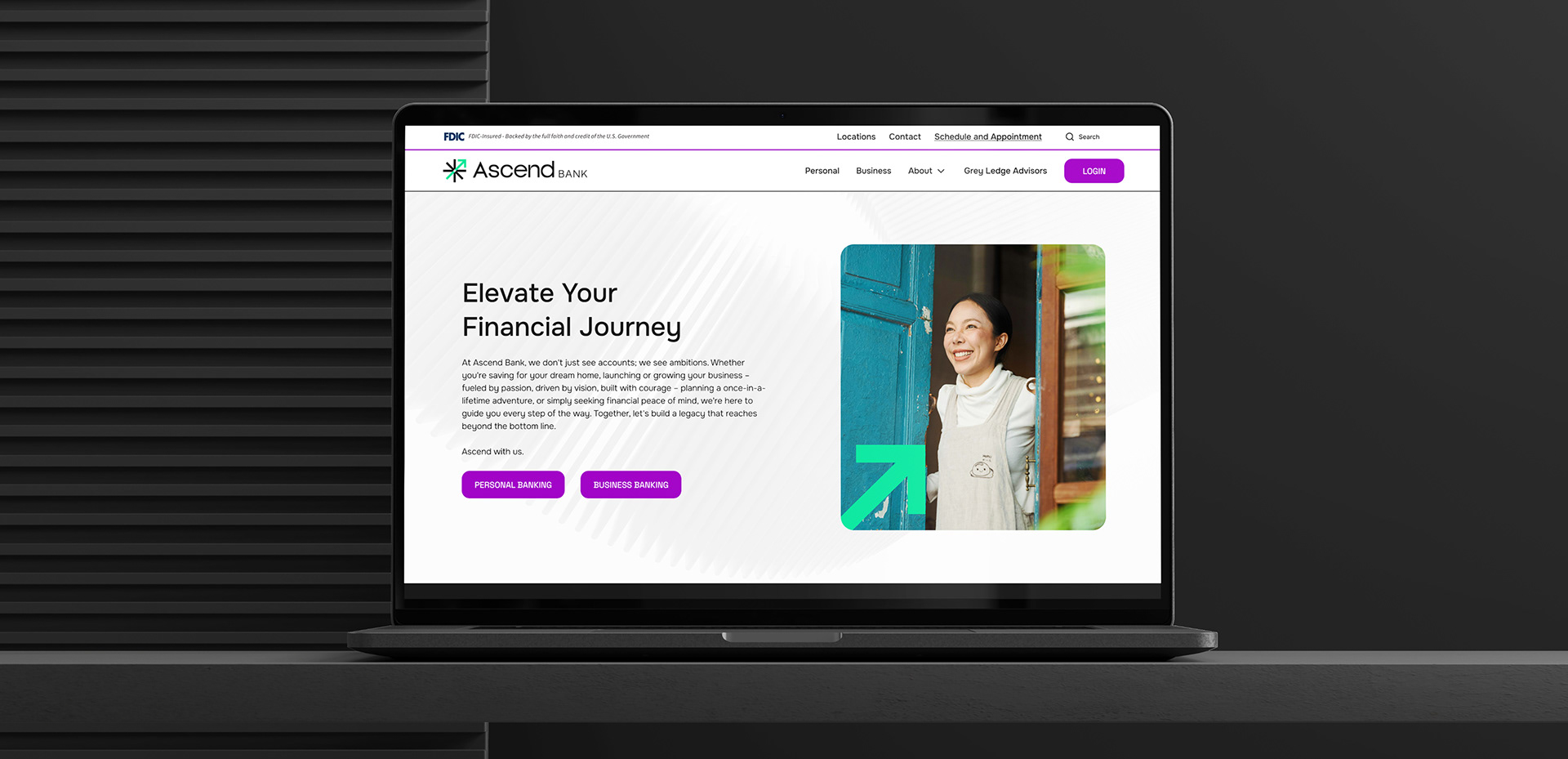
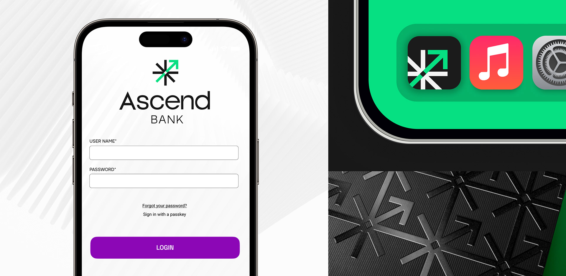
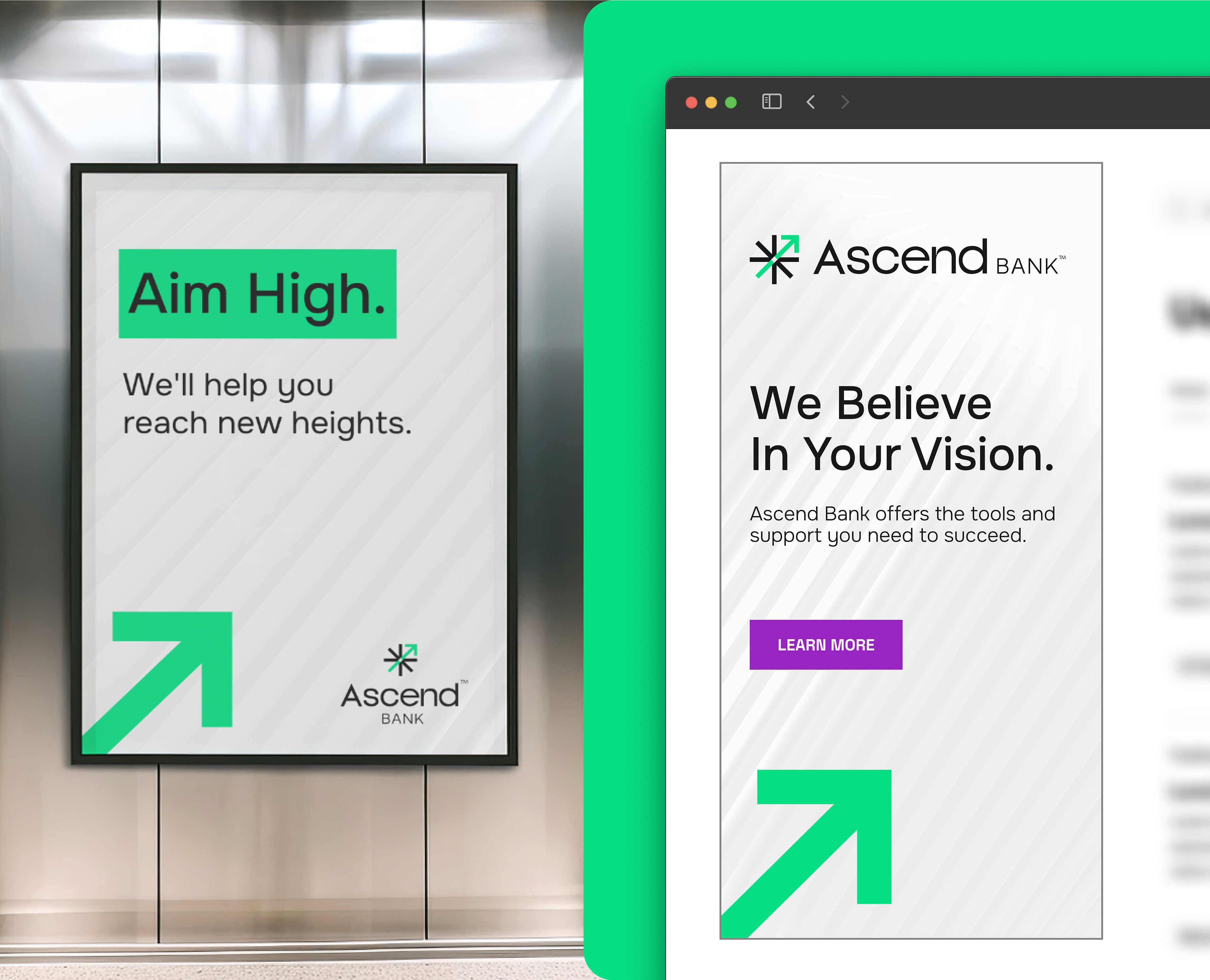

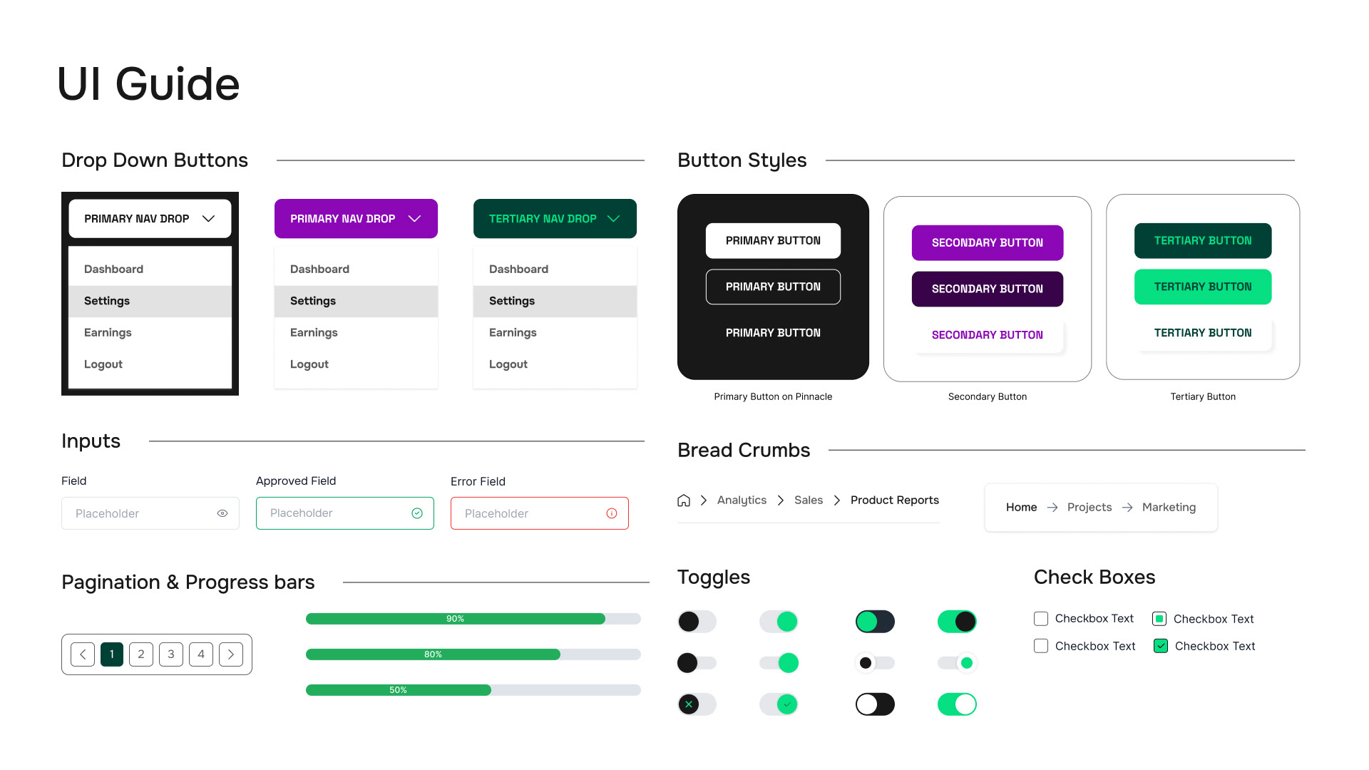
Developed a UI kit based on the website from Ascend.bank, including all necessary components. The entire component library was created in Figma in collaboration with the development team.
The Results:
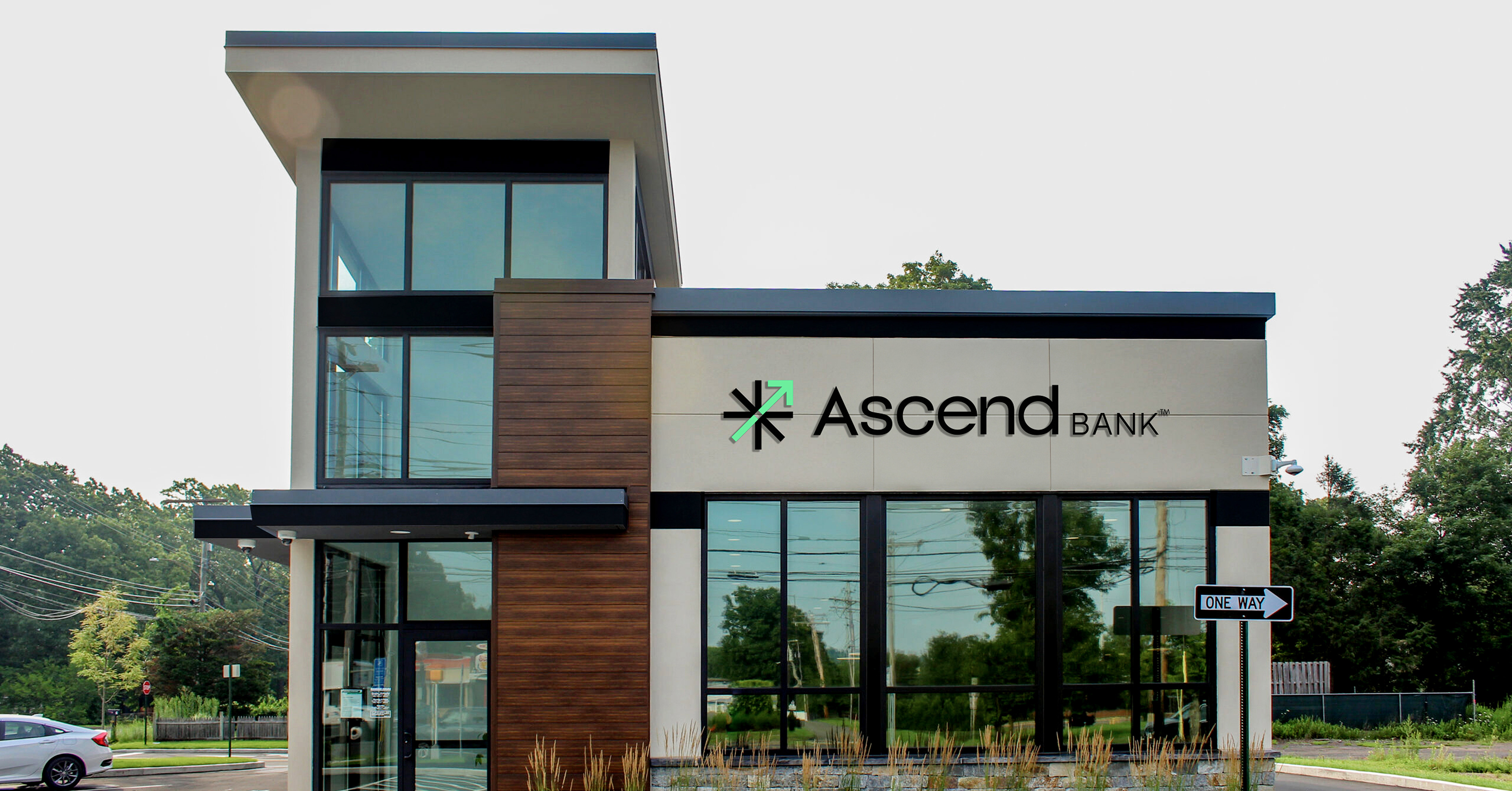
Through a strategic blend of data science, psycholinguistics, and creative direction, I developed a foundational brand identity that GSB can rely on as it evolves from a community bank into a forward-thinking regional financial institution. A key part of that transformation was the use of a modern color palette. The updated identity is clean, contemporary, and deliberately designed to convey stability and approachability. These are qualities people naturally associate with institutions they trust.
At the same time, I made sure to retain the local character that has always defined GSB. We brought in familiar tones inspired by the region, drawing from natural landscapes, local architecture, and recognizable community elements. This grounded the brand in a strong sense of place and tapped into home bias, the tendency people have to trust what feels familiar and close to home.