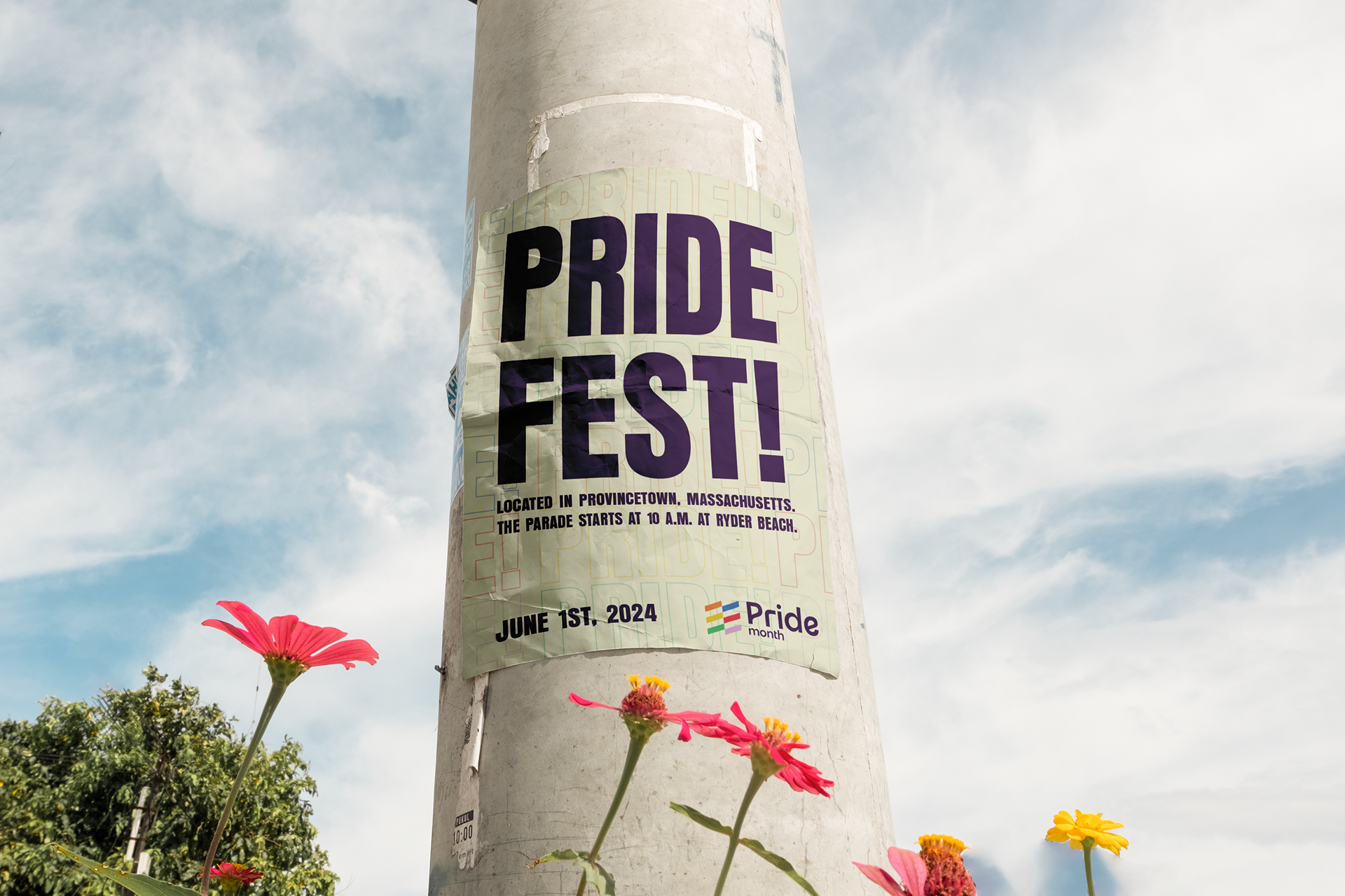
A Summer Visit to Mass
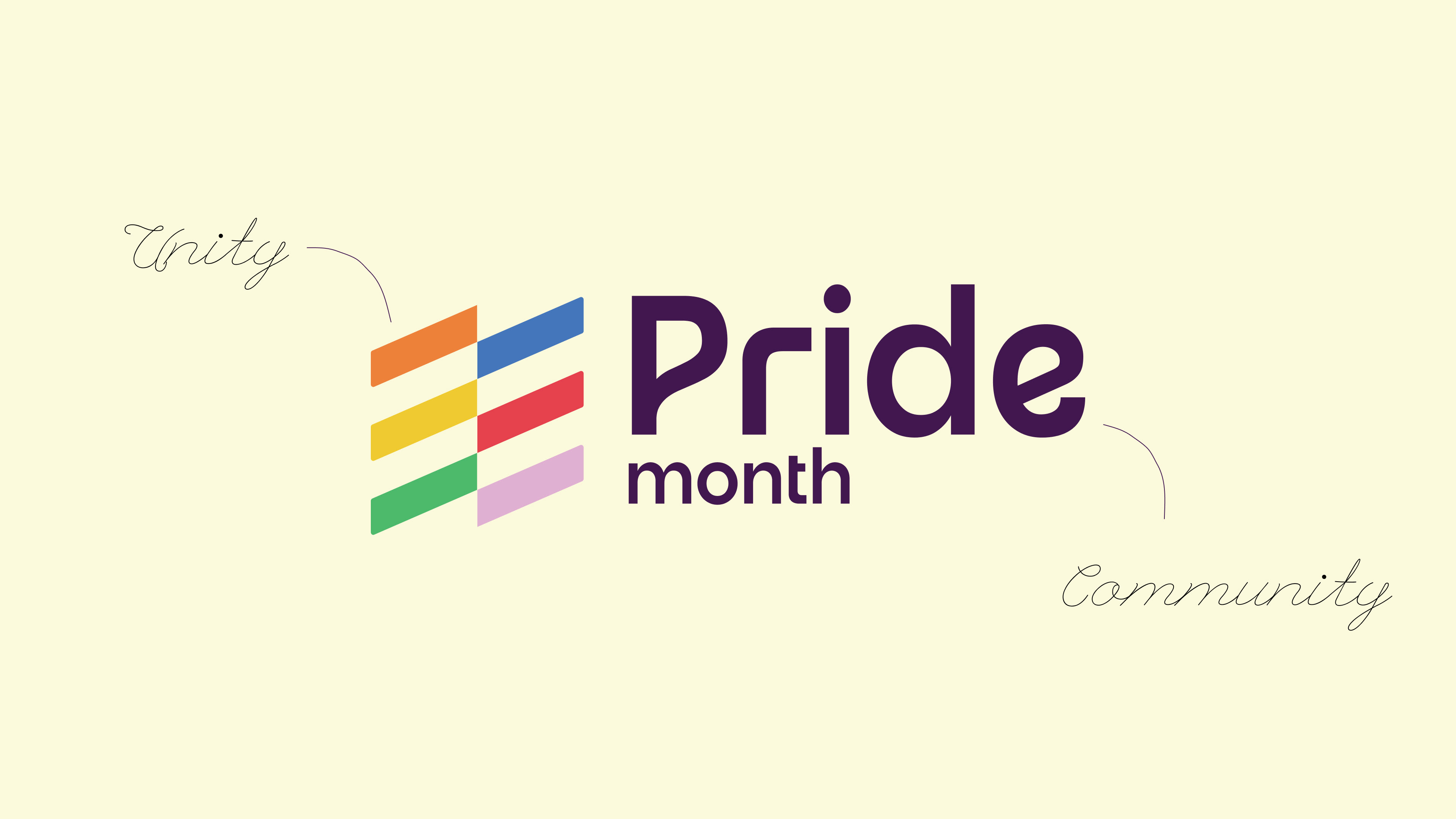
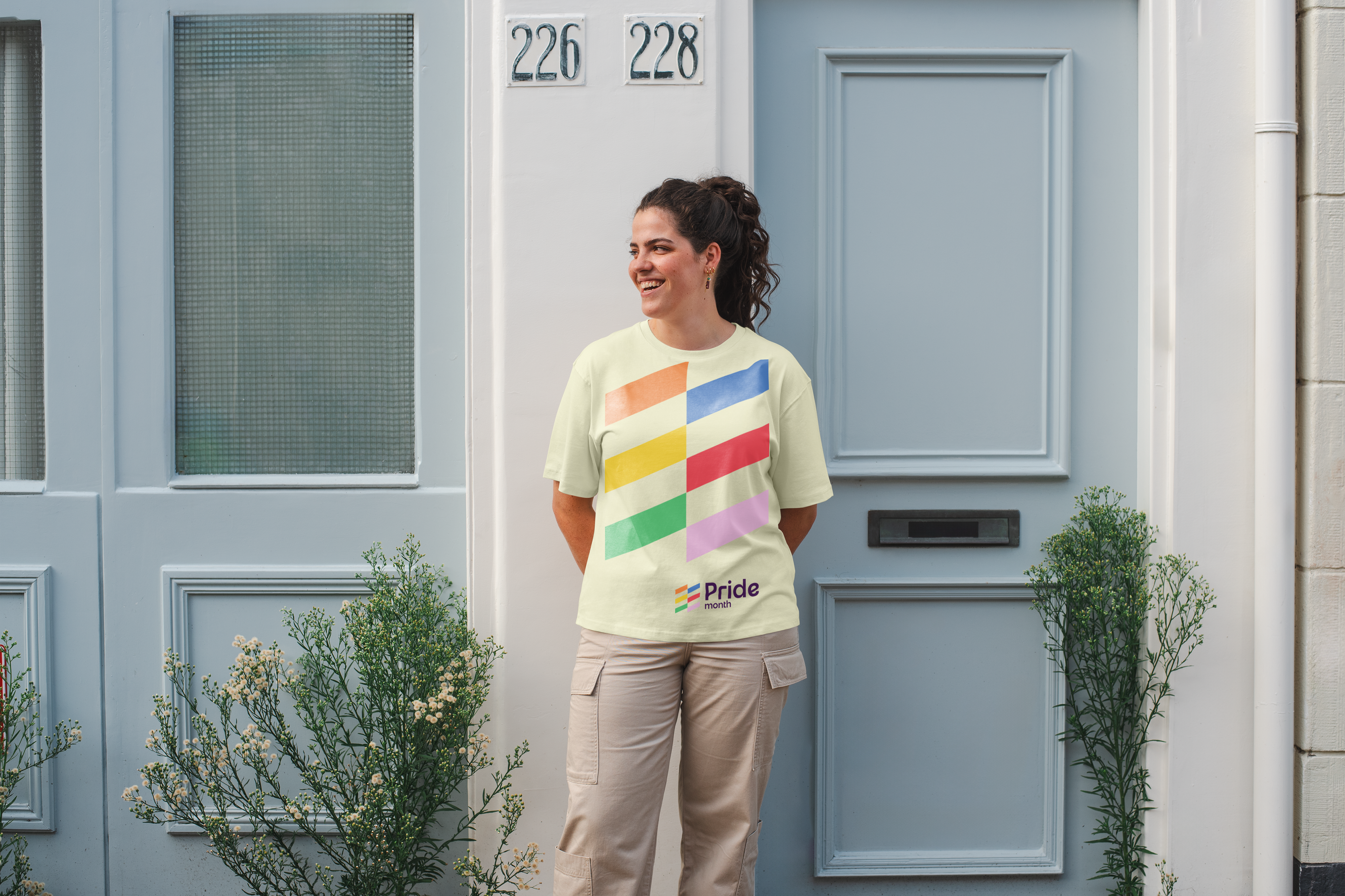
My inspiration for the logo came from the vibrant Pride flag during my visit to Provincetown, MA. Watching the flag wave in the wind sparked the idea to develop a design that showcases depth and the interconnection of coming together. The rounded typography represents friendliness and unity, while the use of cream and purple conveys trust and strength, reflecting the importance of pride the community.
An Idea For Brand Messaging
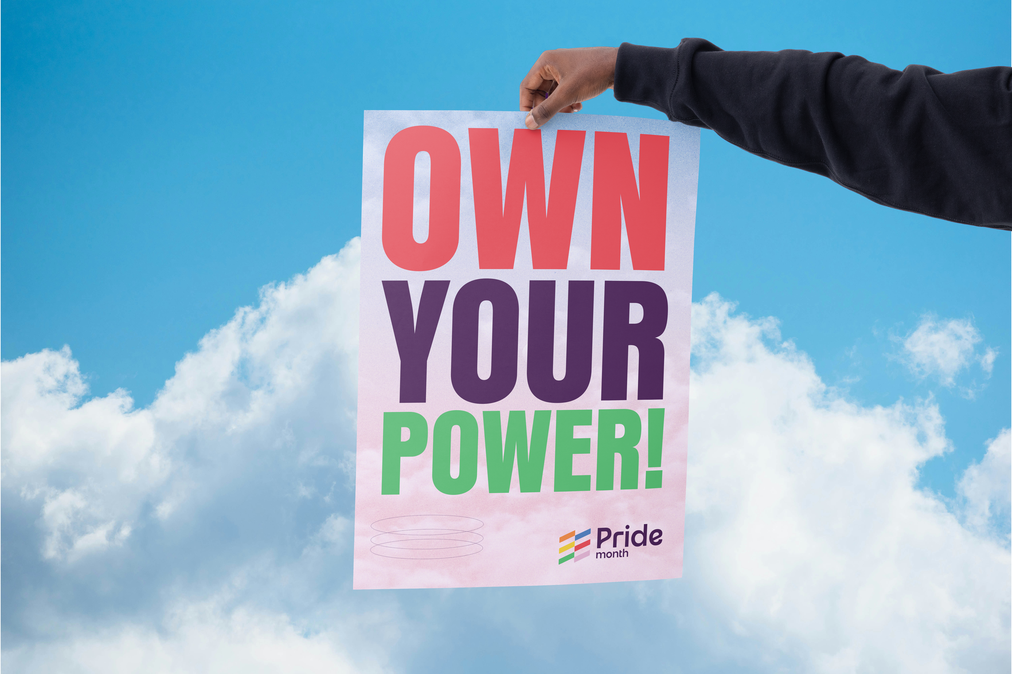
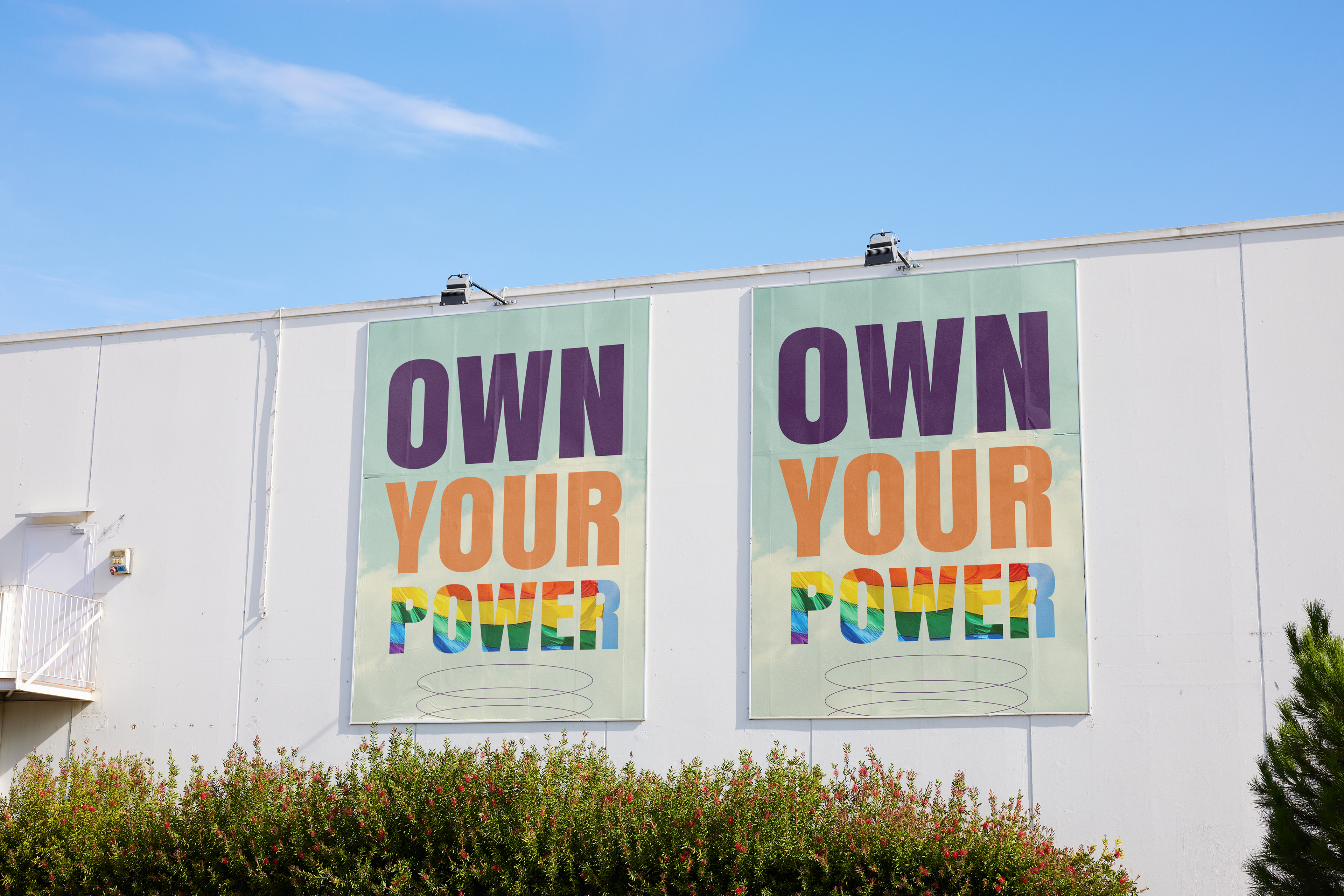
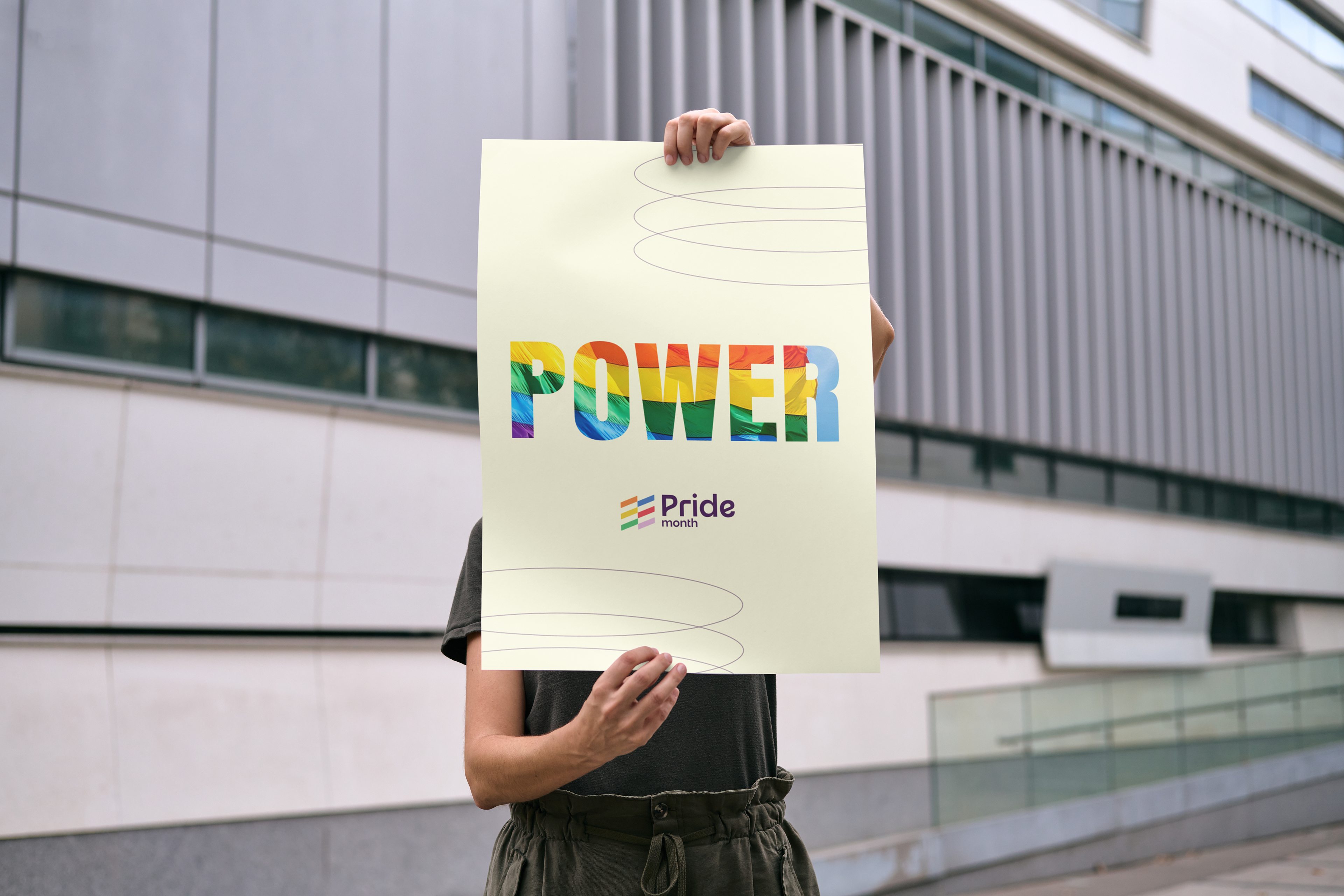
"Own Your Power." This phrase is not only empowering, but it also encourages you to embrace who you are and showcase the unique beauty you possess. Pride Month is an opportunity to solidify brand messaging by collaborating with other LGBTQ+ communities to spread awareness and strength. As I shifted toward a typographical direction, the lines of copy convey unity, aspiration, and togetherness, all while spreading love. "Own Your Power" became a message to celebrate and embrace the uniqueness of each individual. With messaging like "We Find Strength" and "Love for All," we encourage people to participate in their communities and rally for equal rights.
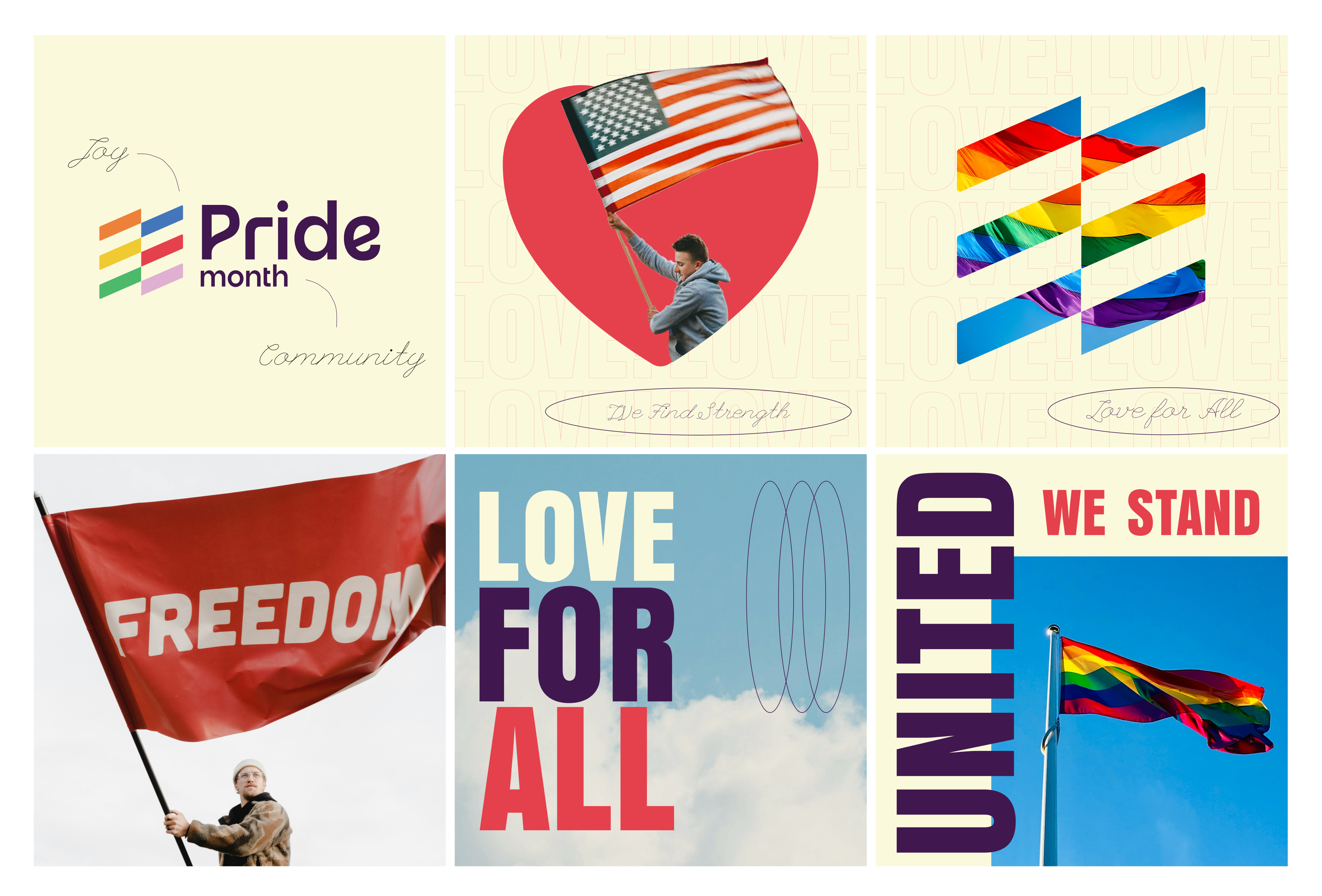
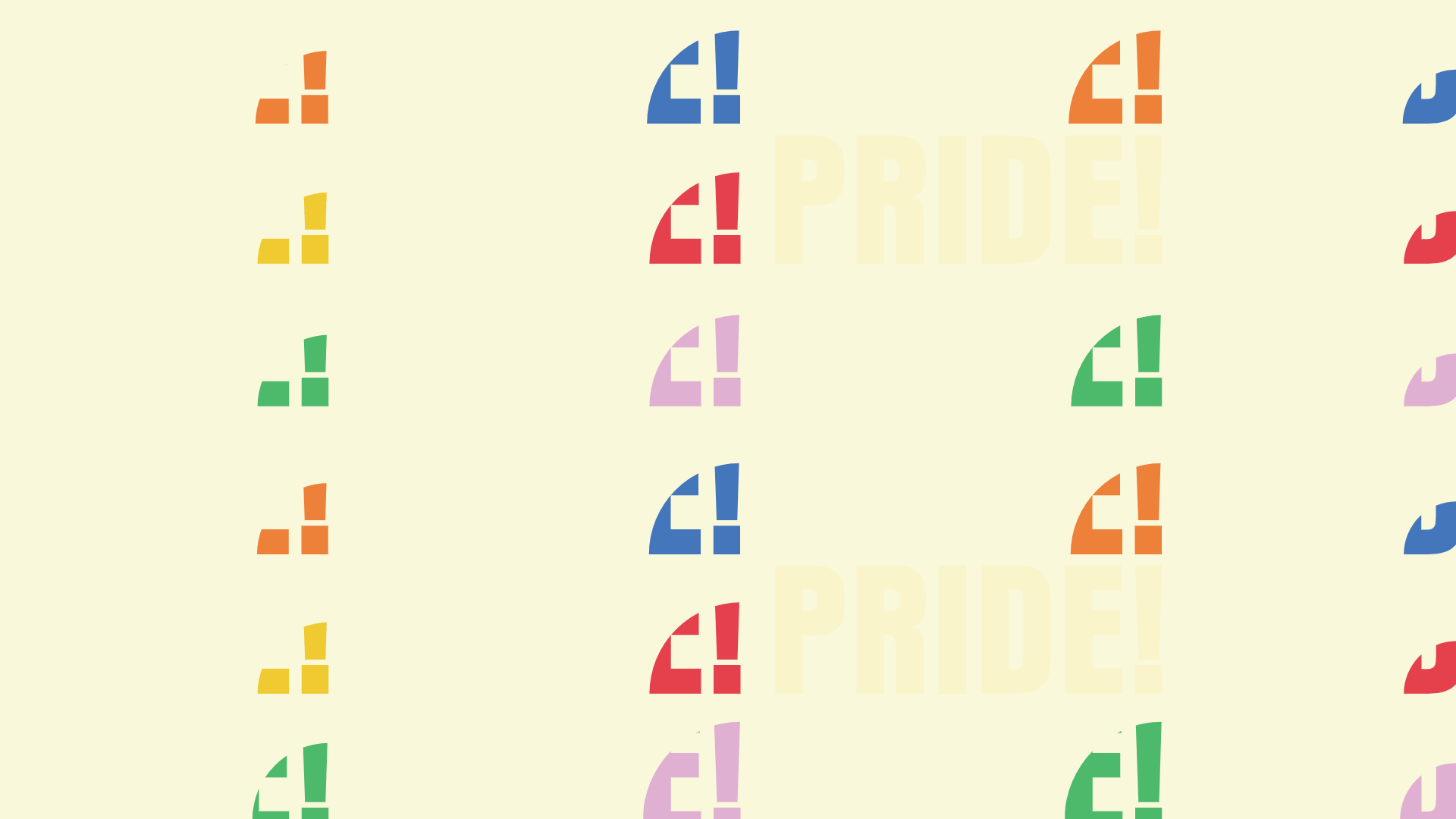
Designers and creatives always find solutions to problems. My solution here is to highlight the importance of love and equality. Design can play a powerful role in societal change and in supporting one another. This project serves as a reminder of the values we must stand for, both as individuals and as creatives. The design features soft colors and positive visual cues to reinforce this message of mutual support.