The Ideation Phase
Before starting any project, I create a mind map in Procreate to explore ideas and research the market. I noticed that many health-focused kombucha brands rely on lifestyle messaging. I wanted Fizzle to feel more playful and approachable. The goal was to position it as a drink enjoyed along the California coastline, where things feel relaxed, lighthearted, and free from pressure. Inspired by brands like Olipop and Poppi, I focused on building a strong visual identity to drive brand awareness. Research helped define what was already in the market and what to avoid in both tone and design.
The Idea Behind Fizzle
In a crowded market, Fizzle Kombucha stands out by emphasizing the probiotic benefits of traditional kombucha, supporting gut health by introducing live, beneficial bacteria. This sets it apart from prebiotic sodas like Olipop and Poppi, which support digestion by feeding existing gut microbes. Fizzle’s naturally fizzy, tangy flavor also offers a more authentic and less sweet alternative to soda-inspired drinks.
The Messaging
The tagline "Because. Kombucha." reflects Fizzle’s identity: simple, bold, and confident. It suggests that the product speaks for itself. This is authentic kombucha made right, supporting gut health and helping people feel their best. To attract new users, I focused on short, direct copy that builds curiosity. Packaging played a key role in the activation strategy, using vibrant color to maximize visibility and memorability. The approach takes cues from brands like Olipop and Poppi but with a more laid-back West Coast feel.
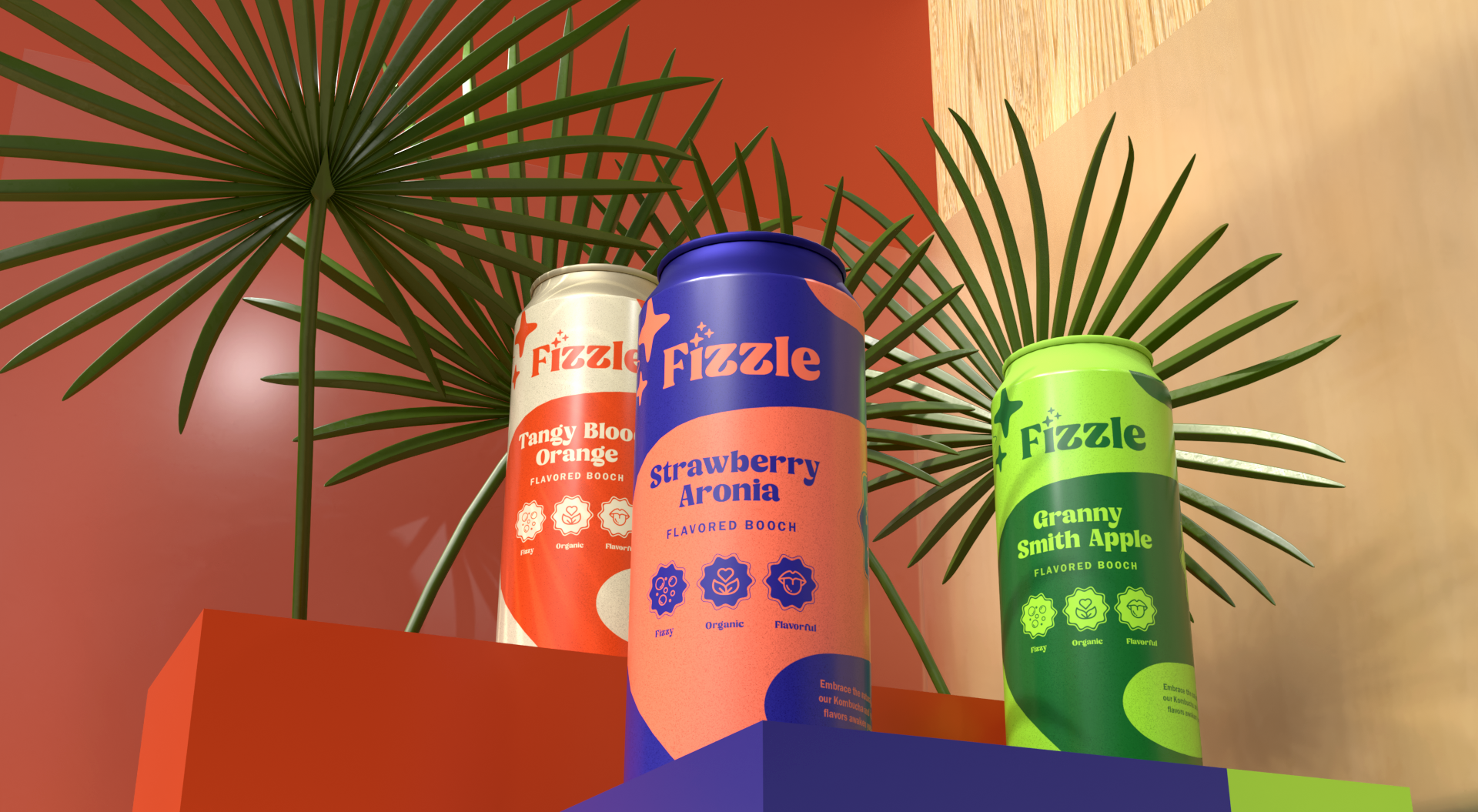
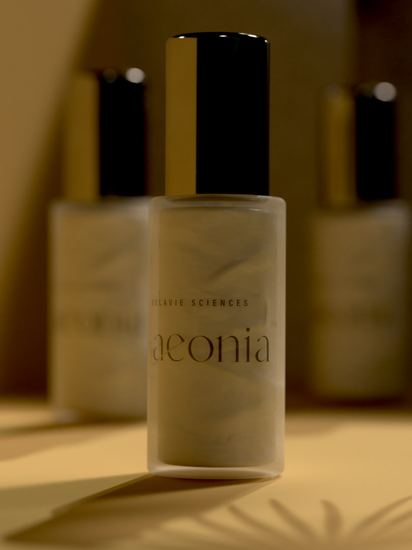
3D Renders Created in Adobe Substance
Activation Material
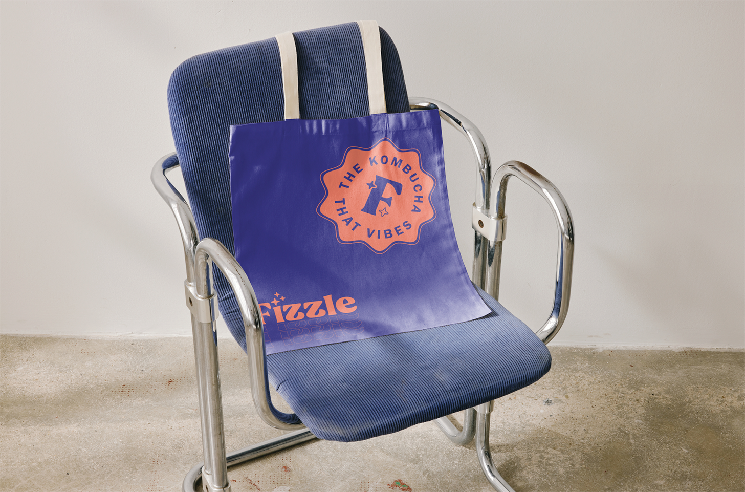
I created branded bags and stickers to gift customers with their Fizzle purchases, encouraging them to tag Fizzle on social media. This builds an organic community sharing authentic Fizzle experiences. I also developed engagement incentives, like a contest to win free trips to the West Coast by sharing your Fizzle story. These tactics help position Fizzle to compete with brands like Kevita and Poppi. Overall, this project focused on establishing the brand’s core message and foundation. If this were a real brand, the next step would be creating a campaign to meet activation goals.
The Effect
Working with 3D animator Luke Dent, we decided to collaborate on developing a 3D animation to showcase our work. Luke animated the bottles spinning in Cinema 4D, while I provided the art direction, assets, and overall look and feel. Working together, we successfully brought the brand to market ready status, creating a strategy to build a strong brand foundation and then expanding upon it with messaging and, ultimately, planning a campaign concept.