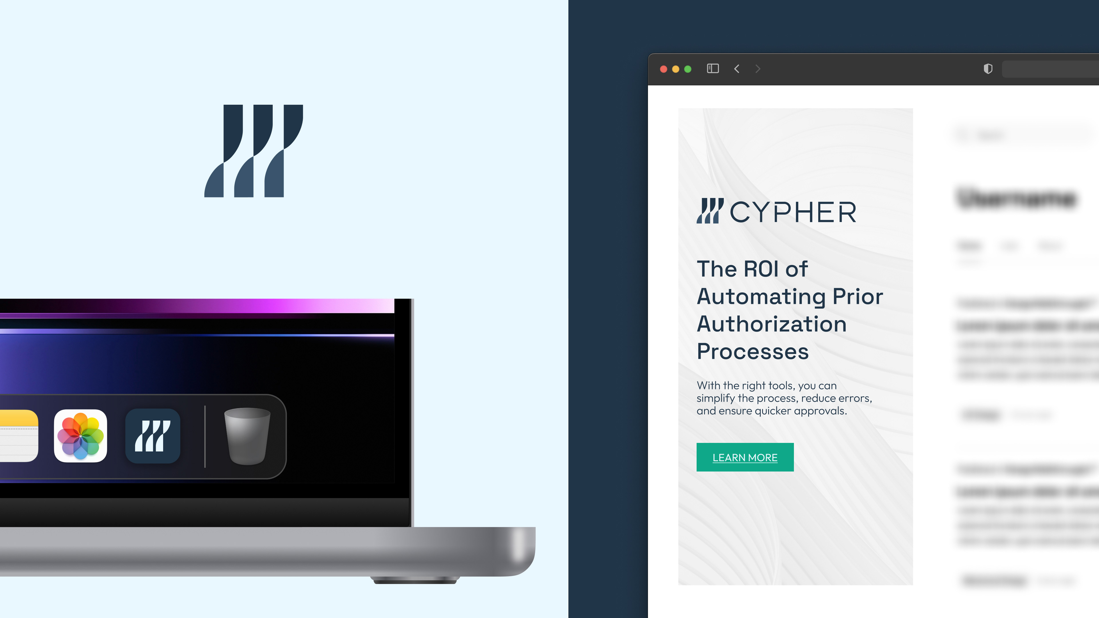
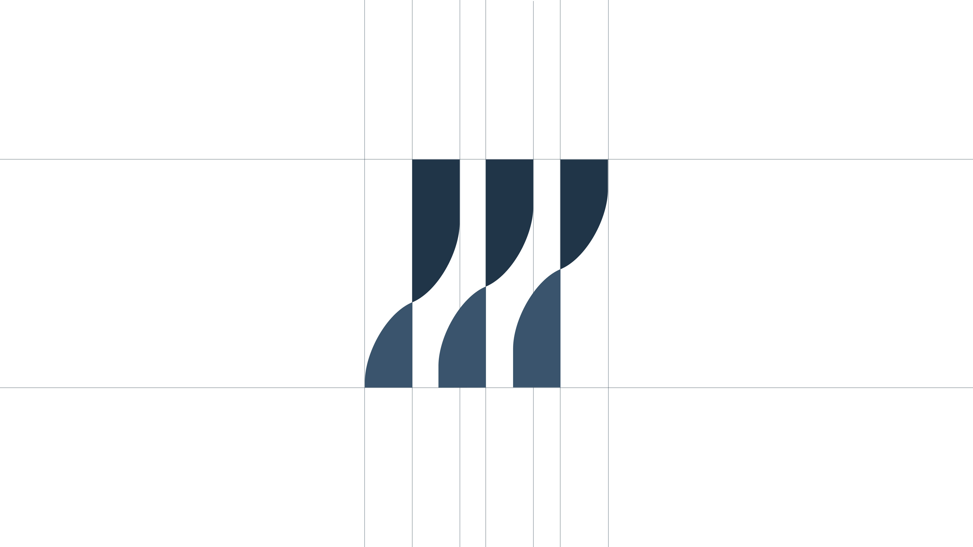
Complex Forms in Simple Terms
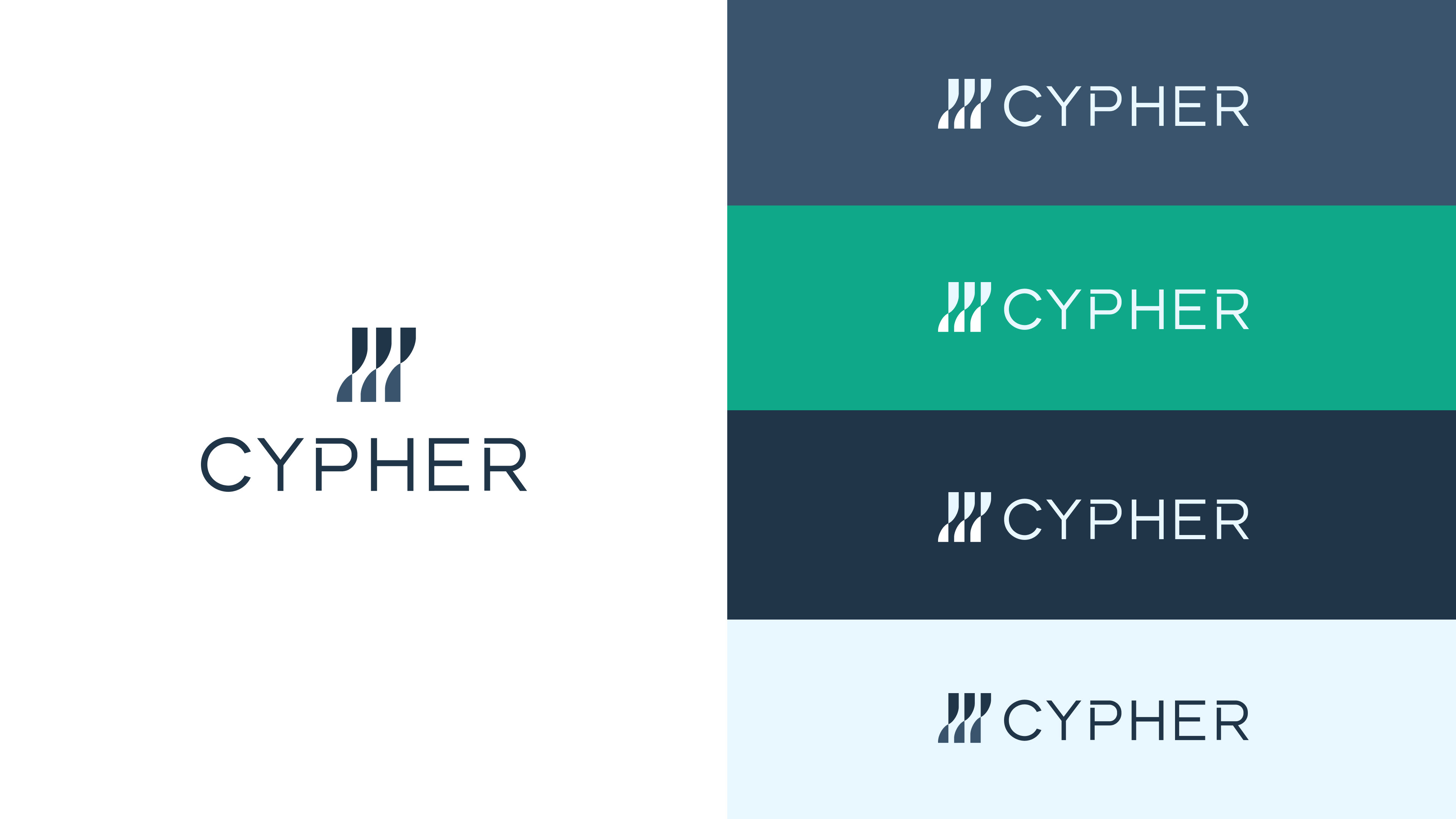
Cypher craved a clean and minimalistic logo. Based on the examples provided, the concept focused on representing complex strands transformed into efficient and optimal solutions, aligning with the company’s goal of optimizing growth. The logo addresses the need for information to remain connected while emphasizing strength and security in the context of healthcare optimization. The design presents a corporate tone, while the curved edges in the glyph introduce a softer and more approachable feel. Initially developed in black and white, color was later introduced to offer a preview of the emerging brand identity.
The solution was recognizing that many healthcare companies relied on illustrative characters and language that did not resonate with patients. Even though this project has not yet gone to market, it stands as a testament to how creative work in healthcare should be approached — clean, simple, and focused on building trust with the patient.