The Evolution:
An upcoming merger prompted me to lead a evolution in the Quantum Biopower brand. With strong equity in the "Quantum" name, I needed to develop a new identity: Quantum Organics. It had to feel familiar but still represent a company at the forefront of organic waste diversion.
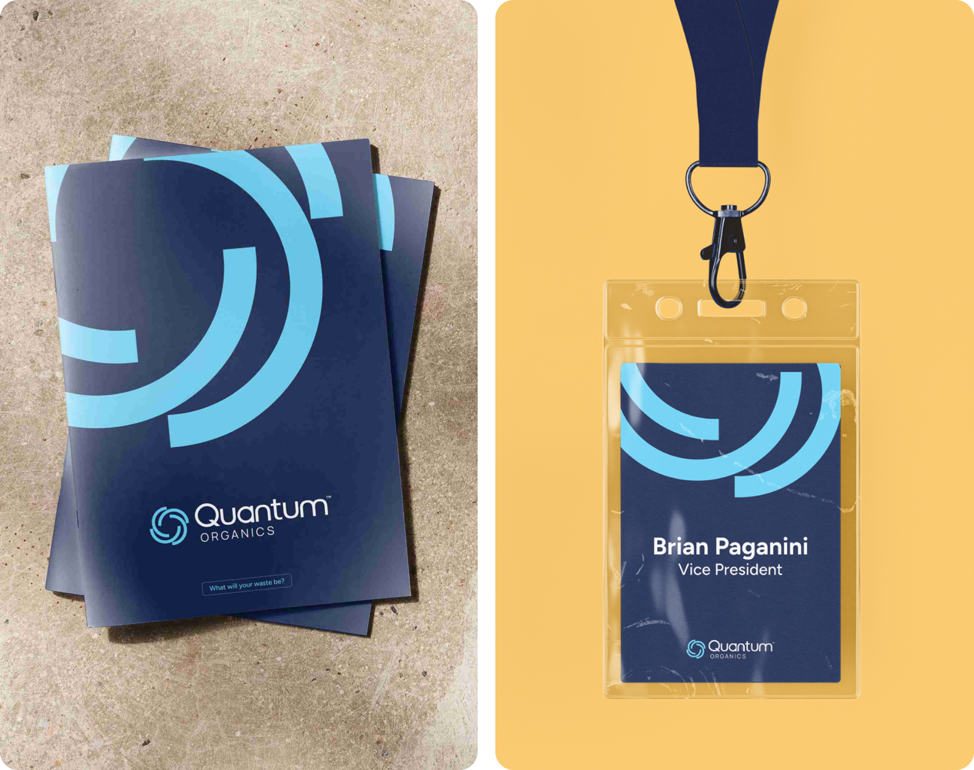
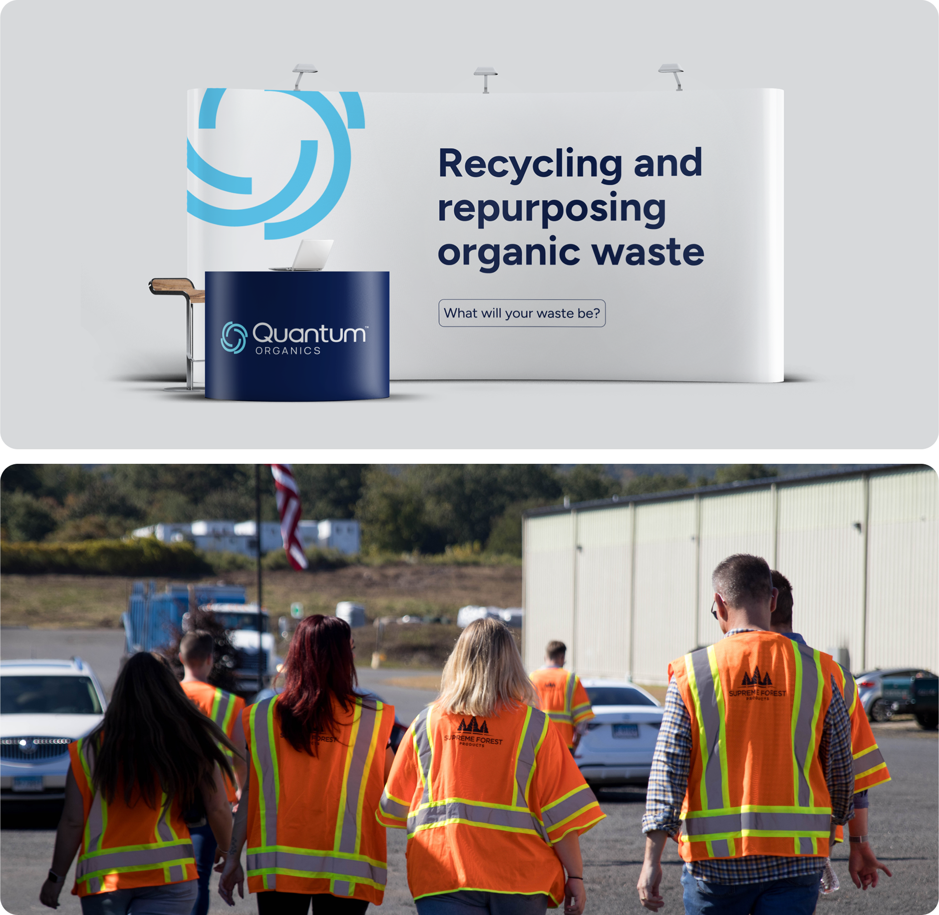
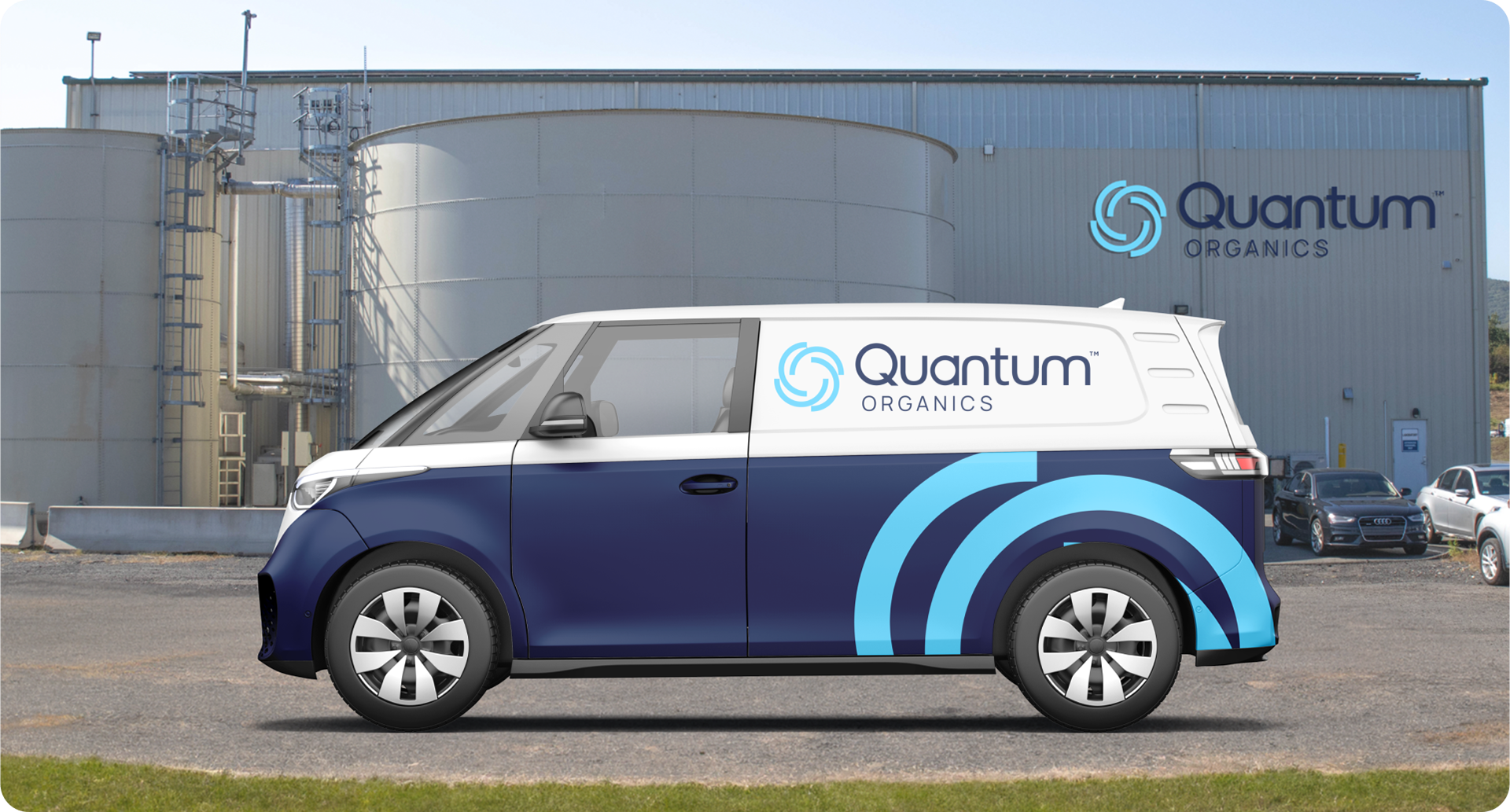
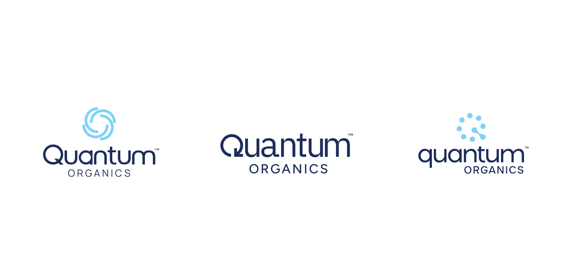
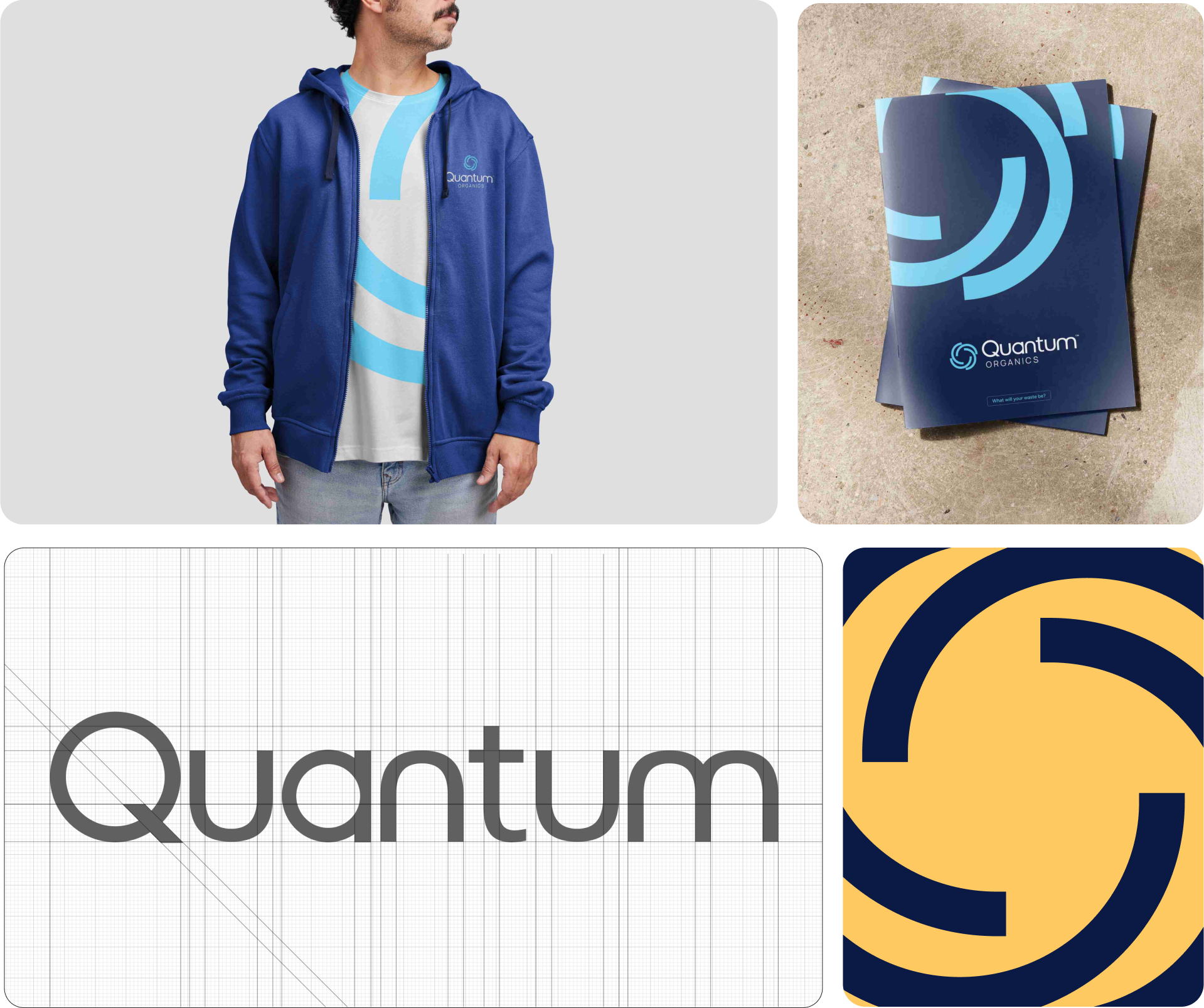
The rebrand needed to be a thoughtful evolution, preserving the core of the existing brand while aligning it with current market trends. I updated the color palette, typography, and logo to better connect with our B2B audience. The redesigned logo was inspired by the continuous swirling motion inside an anaerobic digester, capturing the essence of our process. I presented three design options to the client, and they ultimately chose option one.

The Process:
Unlike many in this emerging industry, I knew Quantum Organics had something real to stand on: a decade of actual experience. While others exaggerated their impact, Quantum stood out by being honest and clear. I needed the brand identity to reflect that same authenticity, evolving into something clean, modern, and aligned with the rise of new technology.


The Research:
Contrasting competitors whose brands are bright, bold, and dense, I infused the Quantum Organics brand with quiet confidence. This was an evolution rather than a revolution of the existing brand, paying homage to Quantum’s roots while emphasizing its capabilities and credibility.