Evolving a Brand Identity Concept
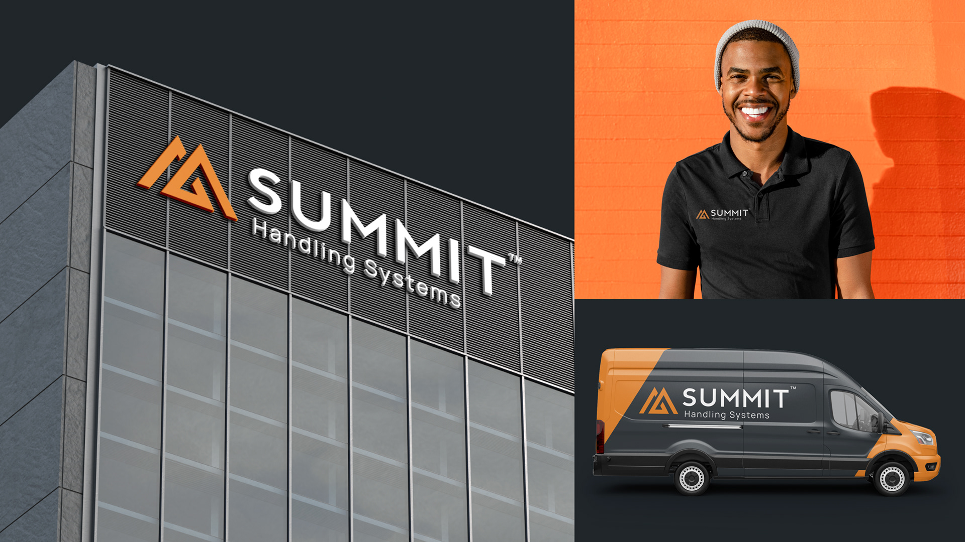
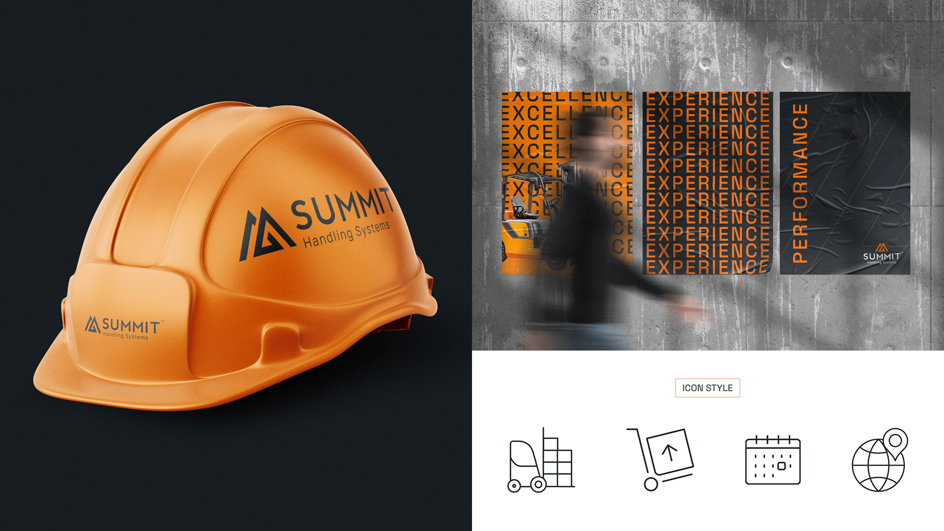
Summit Handling approached us with a challenge: their brand identity had become fragmented, inconsistent, and lacked a cohesive visual presence. As a premier forklift dealer in the Tri-State area, Summit had built a strong reputation, but their close association with Toyota made it difficult to establish their own identity. Seeking independence, they aimed to move away from the Toyota brand. As a branded house, our goal was to evolve Summit’s legacy into a modern, unified identity that stayed true to their mission. I also contributed to a paid media strategy with a bottom-funnel focus, helping to strengthen brand equity and drive a more effective lower-funnel approach.
The Why And How?
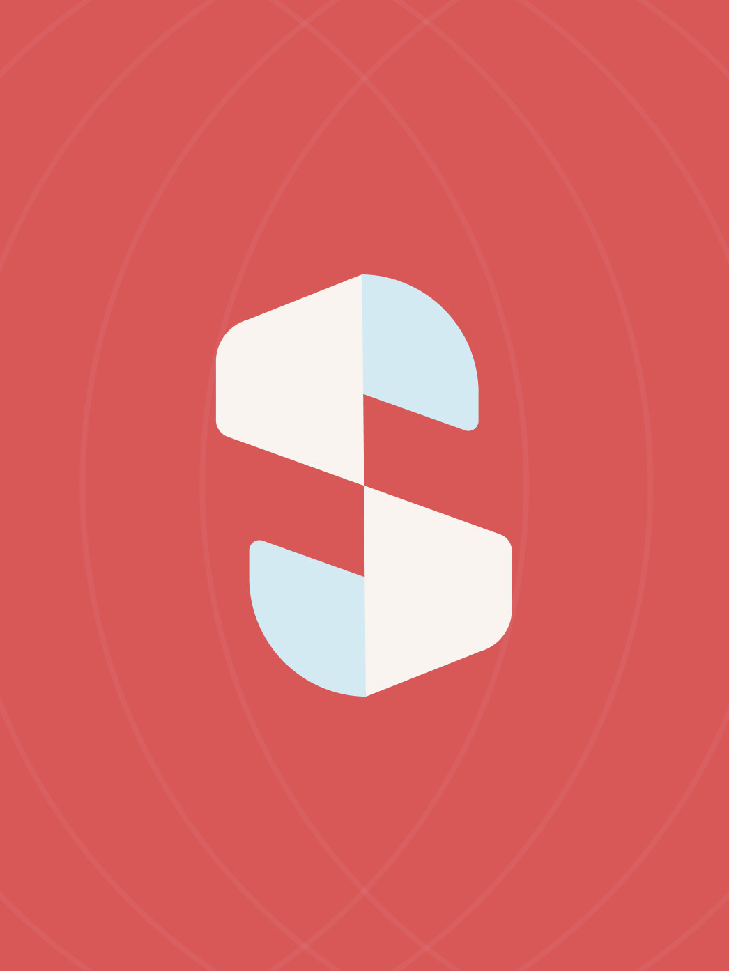
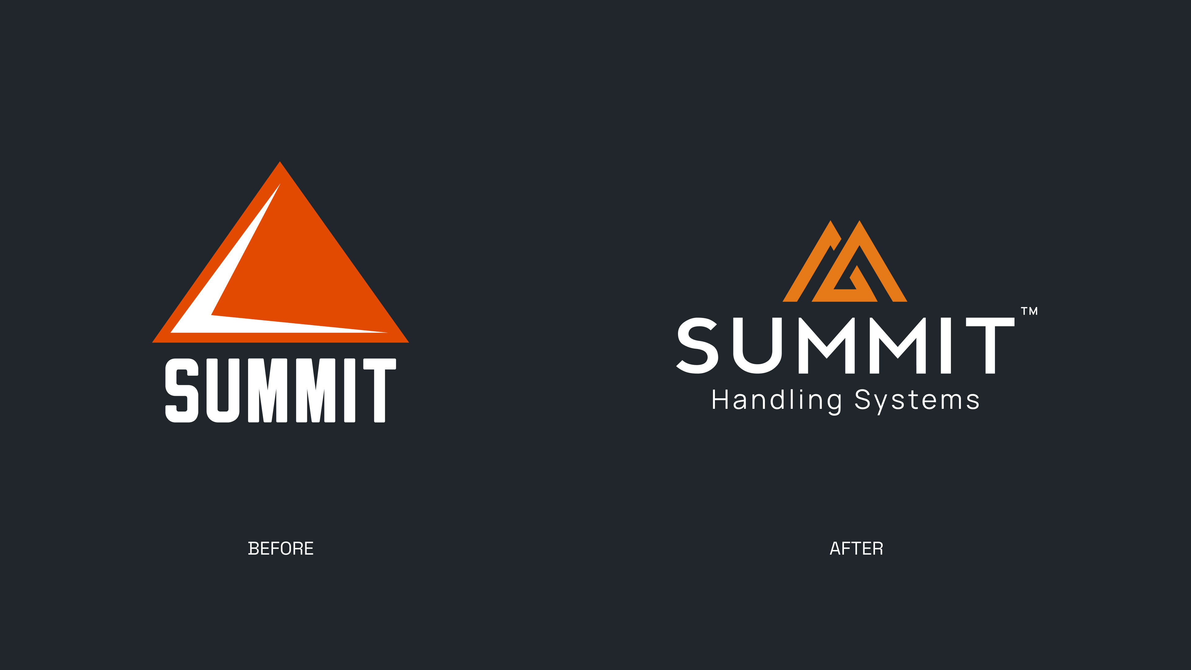
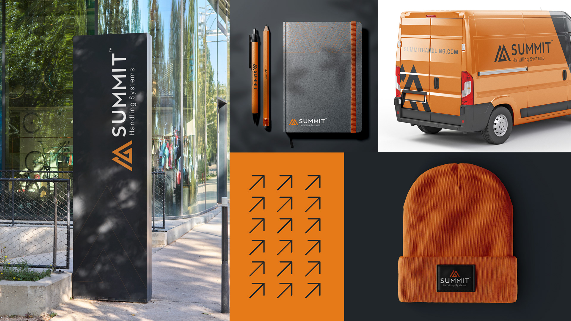
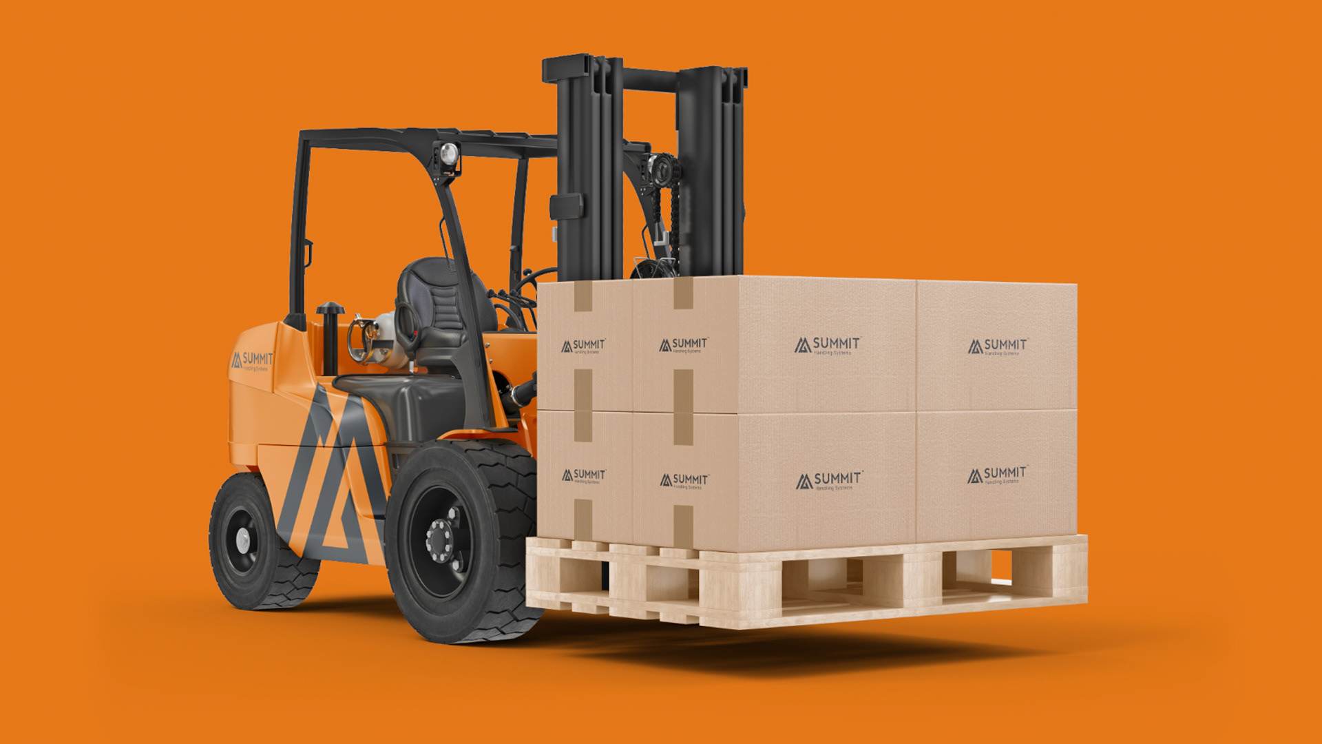
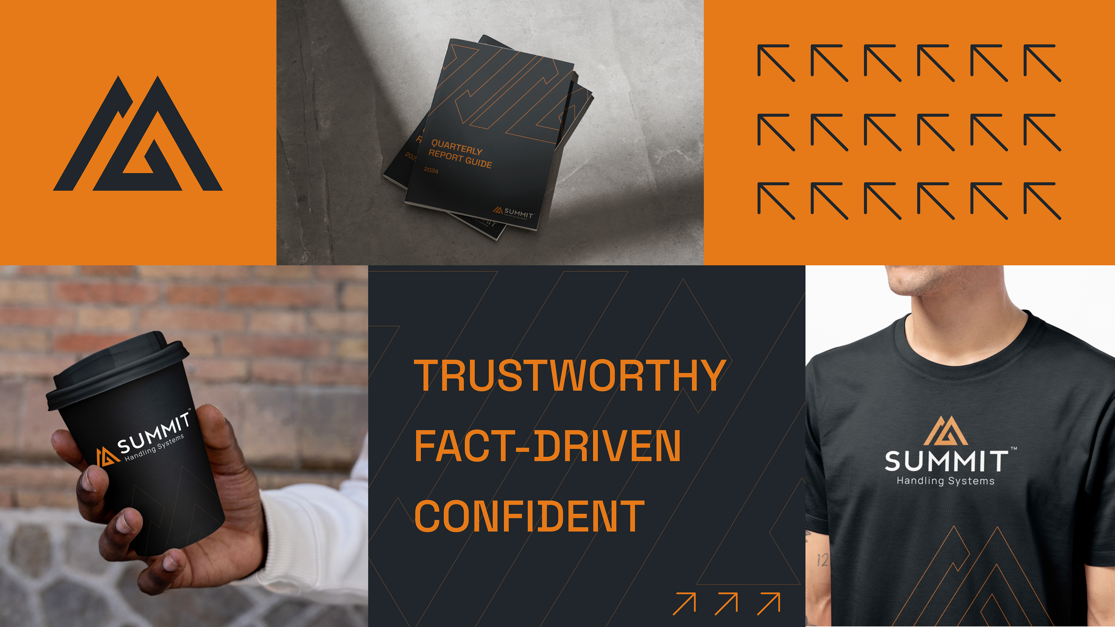
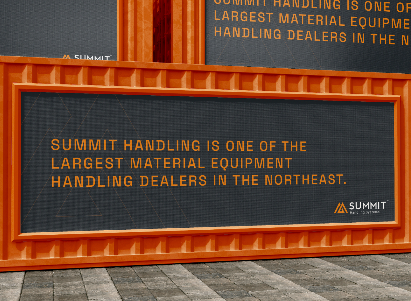
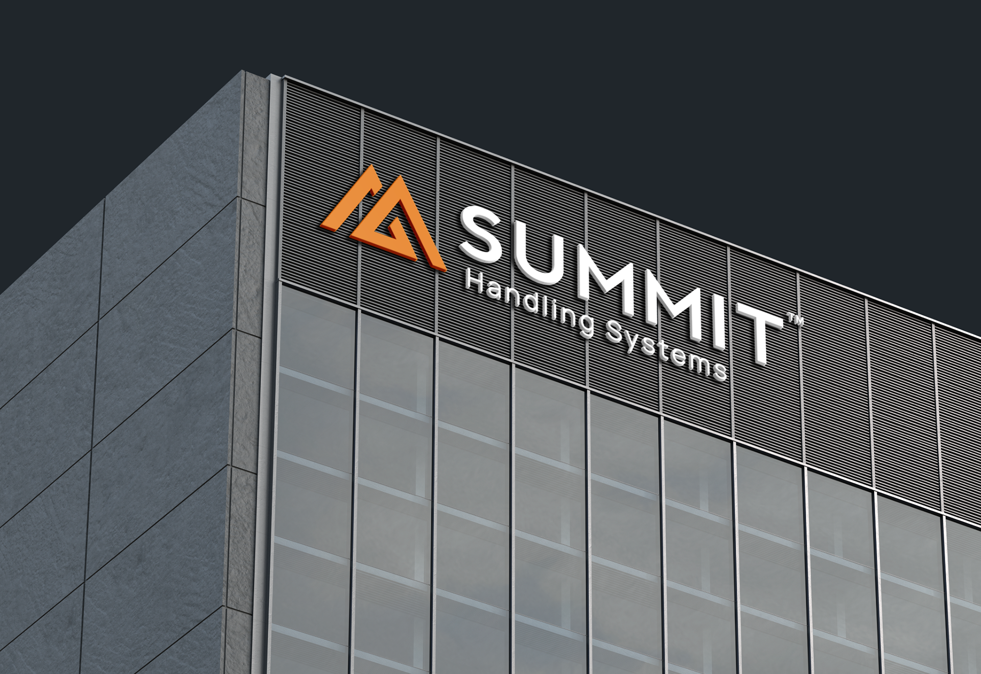
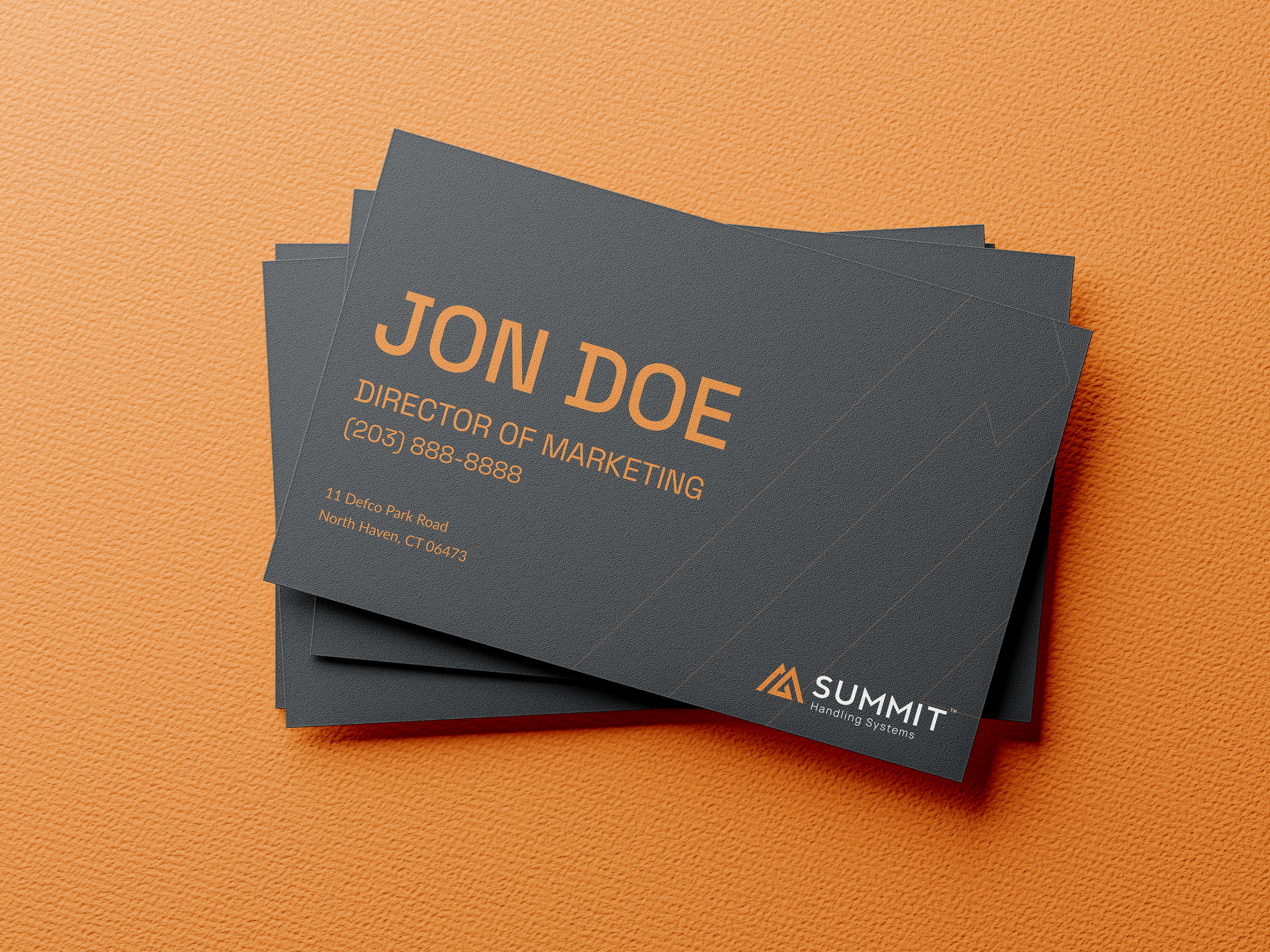
The main challenge was creating a consistent identity with the logo. The original logo’s large glyph overpowered the logotype, and the sharp edges made “Summit” appear condensed. I softened the logo while preserving the “peak” element the client wanted, which symbolizes Summit’s premier forklifts and market leadership. By balancing typography, color, and branding elements, I developed a design that conveys reputation and reliability. Anticipating Summit’s potential expansion into forklift maintenance packages, we created a flexible logo system to support future growth within the branded house.

Summary
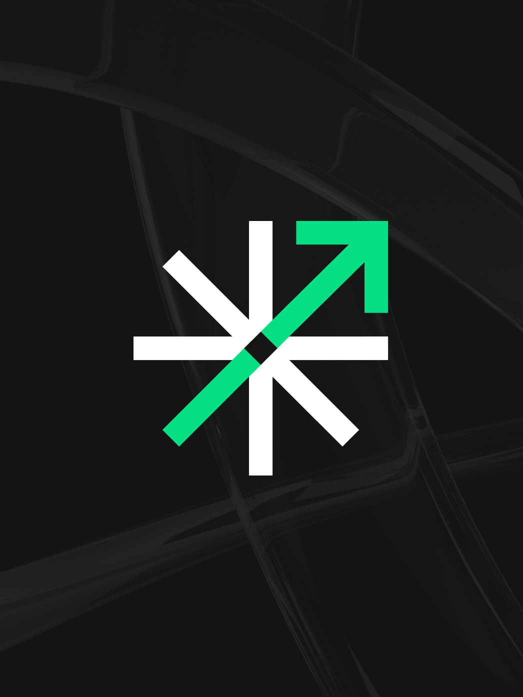
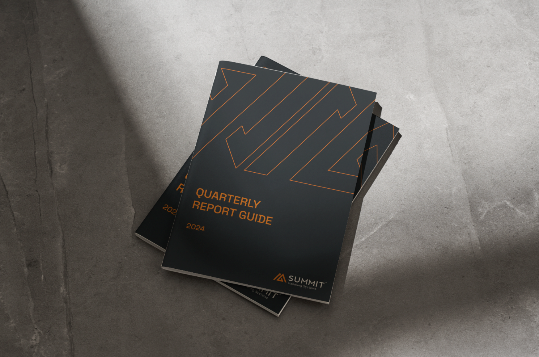
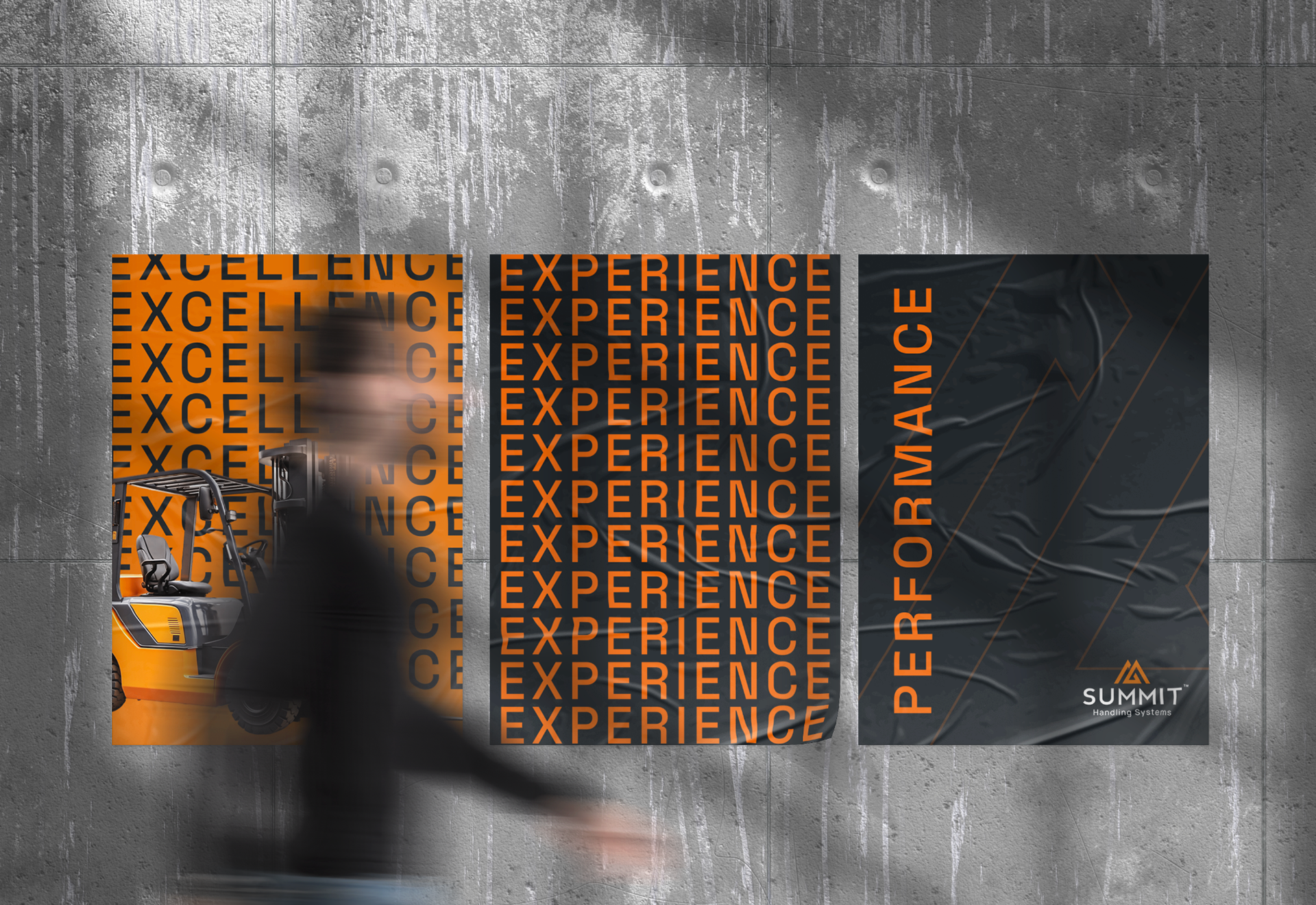
A logo needs to be an integral part of a brand identity. I approached this as a brand evolution, not a redesign—taking the core foundations of Summit Handling’s identity and refining them to be more professional and modern, in line with today’s standards. I decided to evolve the current colors to be softer yet energetic, while balancing the graphic elements. Adding additional arrow textures conveys forward movement and reinforces the messaging of confidence, trust, and a fact-driven approach: key elements of Summit’s mission.