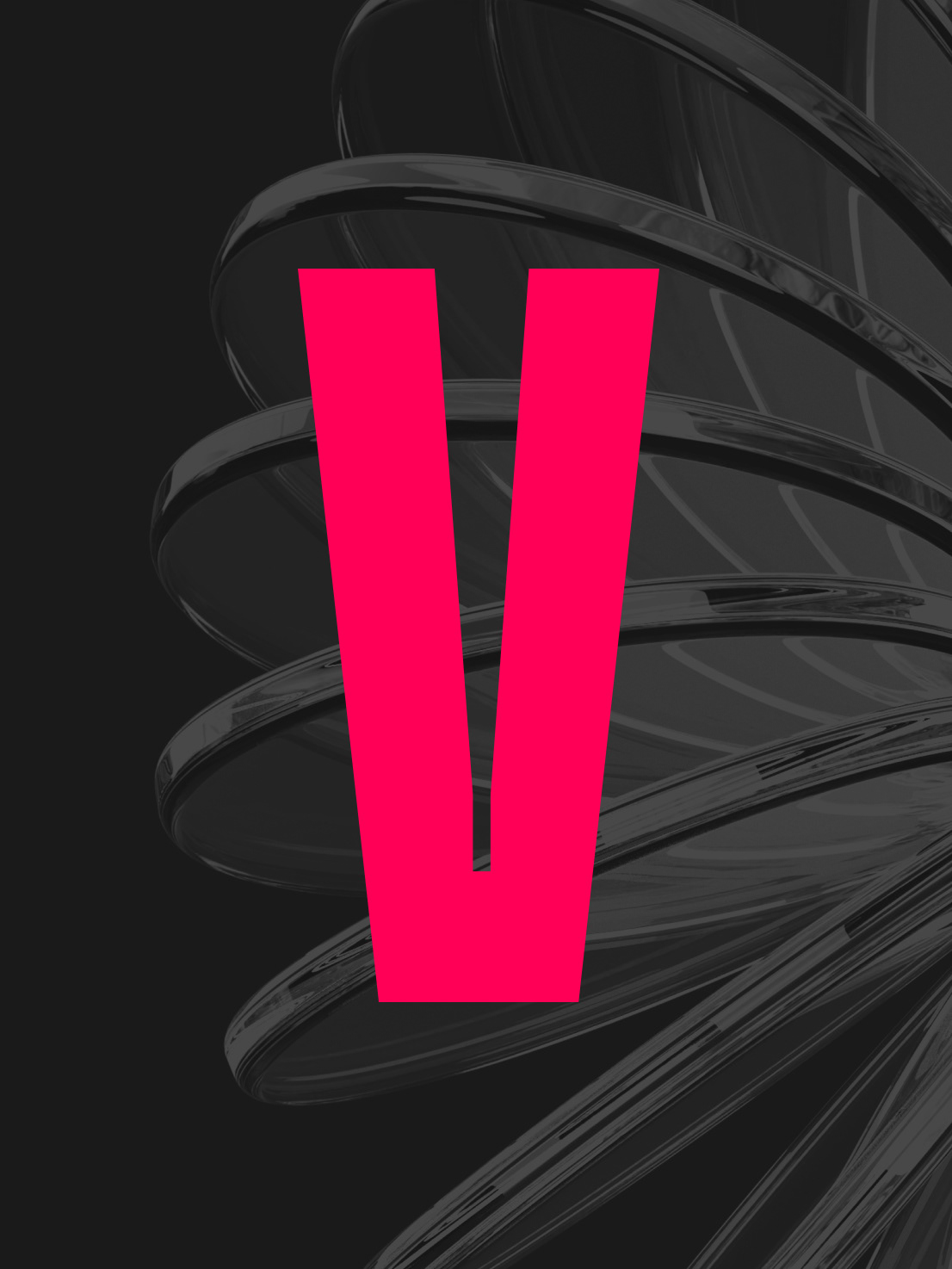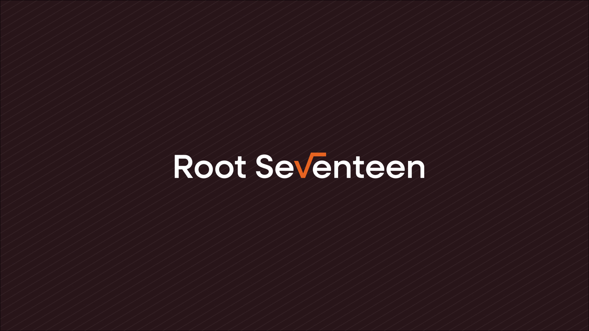
The Square Root
The client wanted a literal depiction of a square root. Since it's a symbol often used in logo design, I needed to find a unique way to incorporate it while still conveying meaning. Through a series of sketched iterations, I had the idea to integrate the square root symbol into the "V" of the logotype. This approach is purposeful, going beyond simply adding the square root and calling it a day, by communicating a clean and reputable design. The square root also doubles as a check mark, symbolizing progress and forward movement. This highlights the simplicity and effectiveness of the solutions Root 17 offers to its clients.
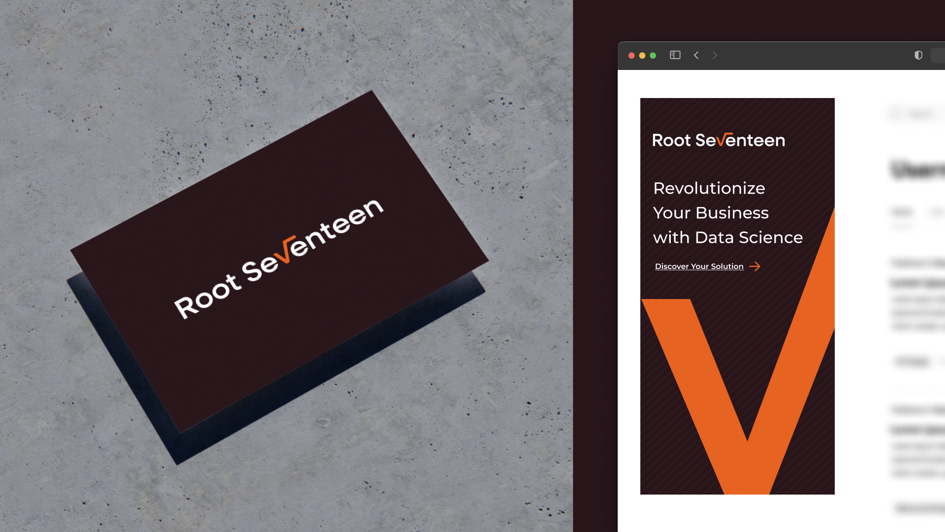
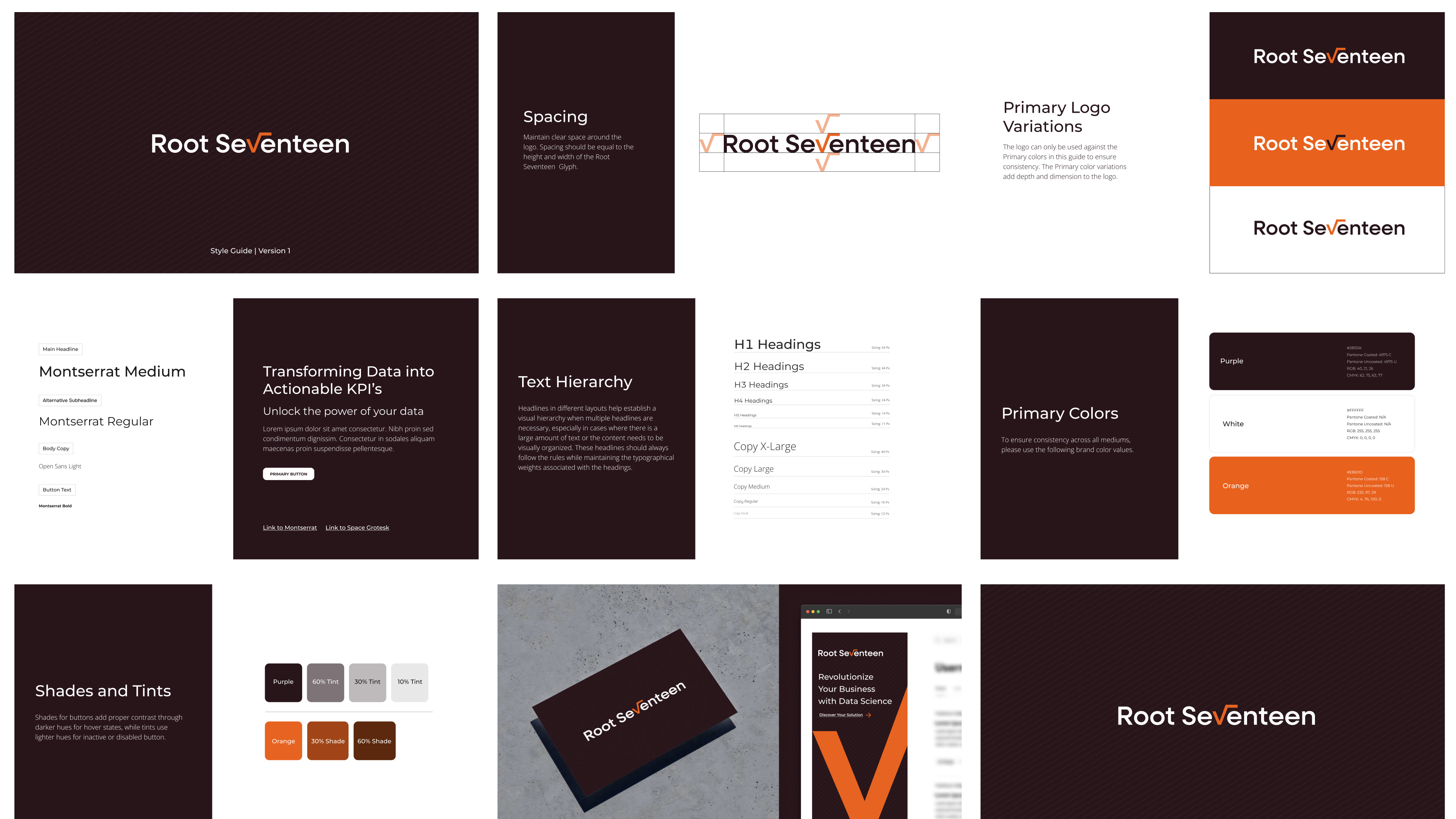

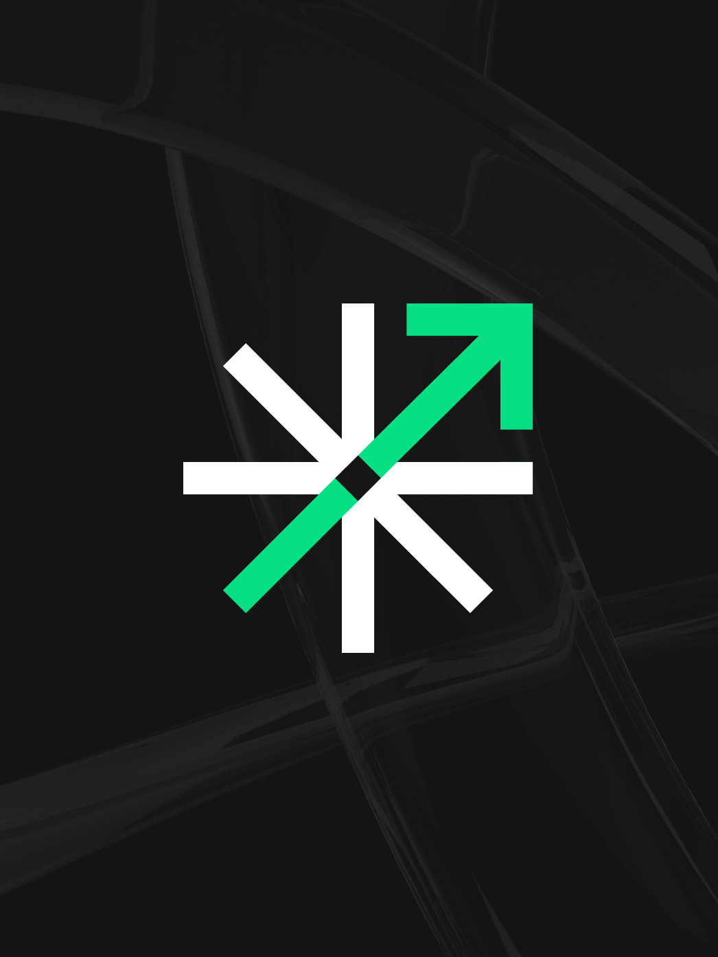
The color palette is the opposite of what you would typically see in a tech-forward data science company. While the client requested warmer tones, I proposed using flat, non-gradient colors to set the brand apart from competitors who rely heavily on gradients. The clean pattern and the use of the square root as a design element contribute to a look that is both soft and bold, reinforcing the overall clean and distinctive aesthetic.